Classic Mac OS 1-Bit UI Design: Chicago Type, 32x32 Icons and Checkerboard Gray
The classic Mac look comes from three constraints: a bitmap font drawn for a 1-bit screen, icons on a 32x32 grid, and pixel patterns standing in for every…
01/ ARTICLE
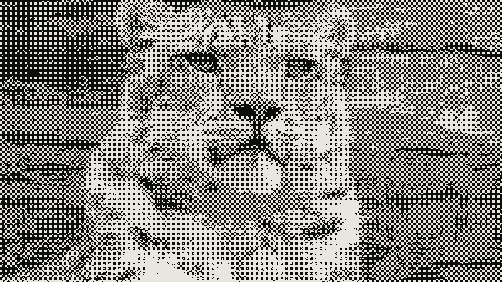 subject: snow leopard · look: bayer · 2x2 matrix · threshold 0.50 · 2px · Image made with kott.io
Introduction
The classic Mac OS look comes from three constraints you can copy: a bitmap font drawn for a 1-bit screen, icons built on a 32x32 grid, and pixel patterns standing in for every shade of gray. Copy those, keep everything else pure black and white, and the interface reads as 1984 with no retro filter at all. This guide is for designers who want the look reproduced with exact numbers, and it uses Wikipedia's Chicago entry and its Susan Kare entry for the facts.
Why does Chicago look the way it does?
Chicago is a 12 pt bitmap system font that Susan Kare designed for Apple, released in 1984, to stay legible on a screen with only black and white pixels. It was a single size, used for menus, dialogs, window titles and text labels, and it was drawn first under the working name Elefont. The variable character widths were a suggestion from Steve Jobs.
The odd shapes follow from the grid. Kare's original fonts were limited to 9 x 7 pixels per character, and she avoided jagged diagonals by using only horizontal, vertical and 45-degree lines. If a Chicago letter looks boxy, that's the constraint showing, not a style choice.
Chicago stayed the system font on early compact Macs until System 7.6, and Mac OS 8 made Charcoal the default instead. Charcoal was drawn by David Berlow of Font Bureau with similar metrics and easier reading. In 1991 Bigelow & Holmes made a vector TrueType Chicago for Apple, matching the bitmap's sizing and spacing, with a slashed zero to tell it from the letter O.
Smoothing is the failure to avoid. If you set Chicago-style type at a fractional size or let the browser anti-alias it, the one-pixel stems turn gray and the face stops looking like Chicago. Use a bitmap font or a pixel font at an integer multiple of its native size, with font smoothing off.
How were the icons drawn?
Susan Kare drew the original Macintosh icons on a 32x32 pixel grid in black and white only, including the Happy Mac that appeared at startup and Clarus the Dogcow in the print dialog. Her font work and icon work share the same discipline: every pixel is either on or off, and every line has to survive that.
Three rules carry over if you draw your own:
- Build the icon on a 32x32 canvas with no anti-aliasing and no transparency tricks.
- Use one-pixel strokes. Diagonals work best at 45 degrees, the same restriction her type followed.
- Express shading with a pattern, never with an extra gray, because there is no gray to use.
How do you get the checkerboard gray in a 1-bit design?
Early Macintosh screens were 1-bit black and white with no gray, so a dimmed menu item was drawn as a checkerboard pattern instead of a lighter color. It's the most recognisable trick of the interface, and an easy one to reproduce.
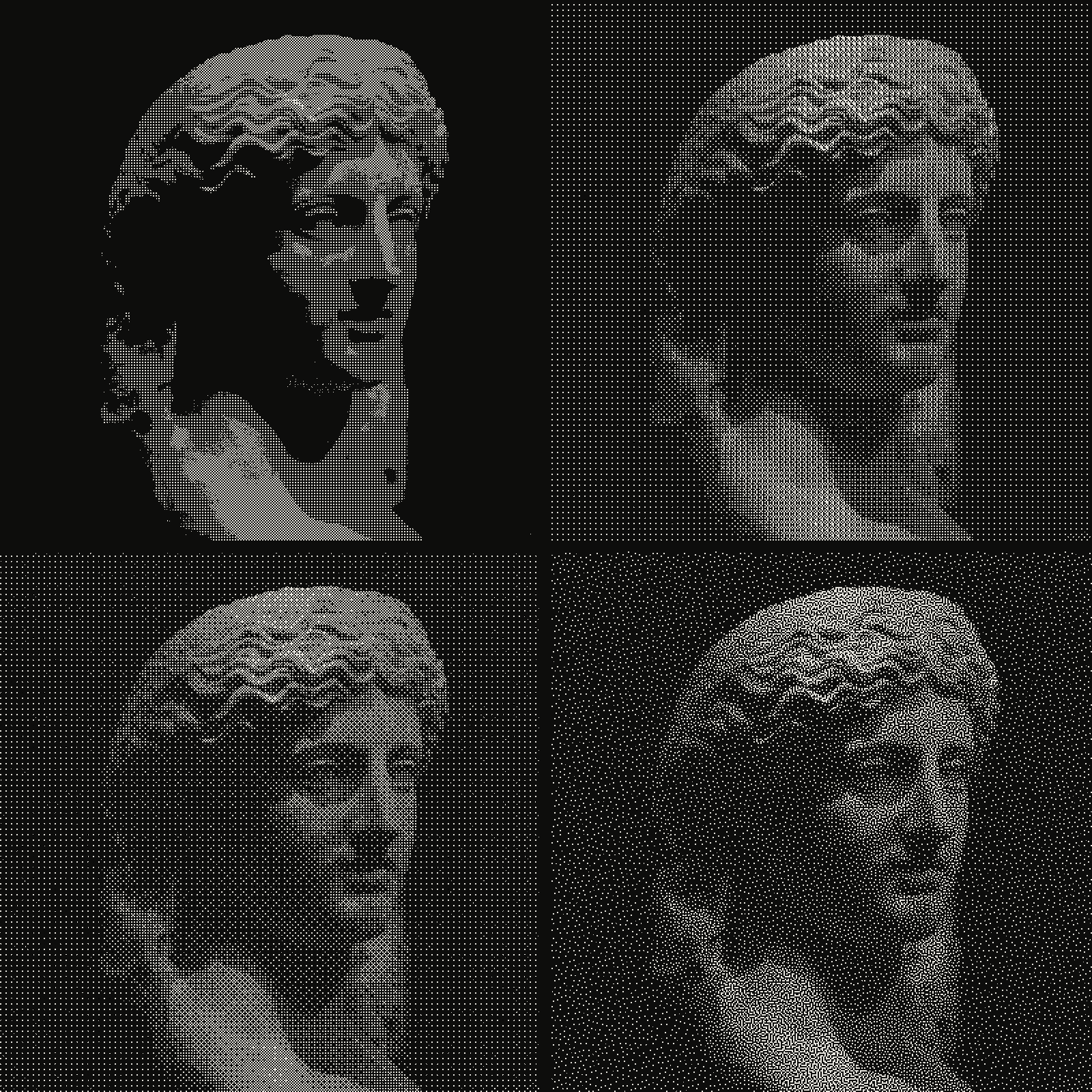 subject: greek statue · look: bayer · threshold 0.50 · 2px · reading order: 2x2 matrix / 4x4 matrix / 8x8 matrix / blue noise matrix · Image made with kott.io
A 2x2 Bayer pattern is a repeating 2x2 threshold matrix that turns each pixel on or off depending on the brightness around it. At 50% gray, two of the four cells in each 2x2 block switch on, and they sit on a diagonal, which is a checkerboard. The same arithmetic gives other grays: one cell on is 25%, three cells on is 75%.
To test this in the kott studio, set the Bayer effect to matrix 0 (2x2), pixel size 1 or 2, threshold 0.5 on a flat 50% gray fill, and you get the dimmed-menu fill. Move to matrix 1 (4x4) when you need more steps than a 2x2 can give.
| Pattern | kott setting | Gray levels | Look | Use in a 1-bit UI |
|---|---|---|---|---|
| 2x2 Bayer | matrix 0 | 5 | Checkerboard at 50% | Dimmed menu items, disabled controls |
| 4x4 Bayer | matrix 1 | 17 | Fine crosshatch | Window title bars, drop-shadow fills |
| 8x8 Bayer | matrix 2 | 65 | Smooth ordered grain | Illustrations, desktop backdrops |
| Blue-noise matrix | matrix 3 | Depends on the matrix | No repeating grid | Photos, where a visible grid distracts |
| Flat threshold | no pattern | 2 | Hard black and white | Text, borders, icons |
The gray-level counts are the number of pixels in the block plus one. For the difference between patterns like these and a dot screen, read halftone vs dithering, and try the patterns in the dither tool.
What breaks when you scale a 1-bit interface?
Scaling breaks it fastest. A pattern fill only works when each pattern pixel lands on exactly one screen pixel, so the interface has to be scaled in whole steps: 2x, 3x, 4x, never 1.5x.
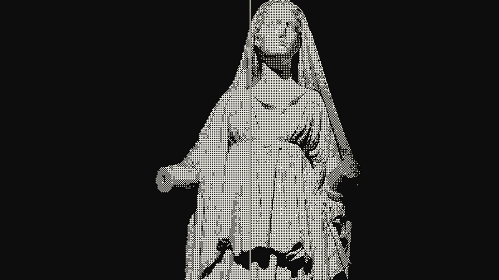 subject: marble sculpture · look: bayer · 2x2 matrix · threshold 0.50 · 1px · left: dithered at 532x300 then bicubic-upscaled to 1600x900 · right: dithered at 1600x900 · Image made with kott.io
At a fractional scale the checkerboard resamples into uneven gray blotches and the one-pixel strokes of the type get different widths from line to line. A pattern rendered at 1px and then enlarged three times also goes soft, which is the same failure you see when you enlarge any ordered dither. Render the pattern at its final pixel size instead.
Fixed grids force the same discipline elsewhere. The ZX Spectrum attribute clash is another hardware limit that shaped how a whole look is drawn.
What do you keep when you recreate the look today?
Classic Mac OS launched on January 24, 1984 with the Macintosh 128K. Its later versions moved to a shaded greyscale look called Platinum, so a convincing 1-bit recreation means the earlier look, not the later one.
Keep the integer grid, pure black and white, pattern fills, bitmap type at native size, and 45-degree-only diagonals. Leave out gradients, soft shadows and anti-aliasing, because each of those needs more than one bit per pixel. The same logic of rebuilding a look from its hardware limit applies to the Game Boy Camera filter.
If you plan to ship a Chicago-like face, check licensing first. The original is Apple's, and clones carry their own licences.
To see the checkerboard fill and the other Bayer sizes on your own image, open the Bayer effect in the kott studio and step the matrix from 0 to 3.
Frequently Asked Questions
What font did the classic Mac OS use?
Chicago, designed by Susan Kare and released in 1984, as a single 12 pt bitmap size for menus, dialogs, window titles and labels. It stayed the system font on early compact Macs until System 7.6, and Mac OS 8 replaced it with Charcoal.
Is there a vector version of Chicago?
Yes. Bigelow & Holmes made a TrueType version in 1991 that matched the bitmap's sizing and spacing, with a slashed zero. Check the licence of any Chicago clone before you ship it in a product.
How big were the original Mac icons?
Susan Kare drew them on a 32x32 pixel grid, in pure black and white.
How do I get the dimmed-menu look without gray?
Fill the dimmed item with a checkerboard of alternating black and white pixels, which is what a 2x2 Bayer pattern produces at 50% gray.
Images in this article were made with kott.io.
02/ OUT
Every setting described above is a real control. Open your own image and sweep it.
All journal entries