Which Dither Mode to Use for Laser Engraving Photos, Tested by Material
LightBurn ships five photo dither modes. The right one depends on your material's tonal range, not on which looks best in a tutorial screenshot.
01/ ARTICLE
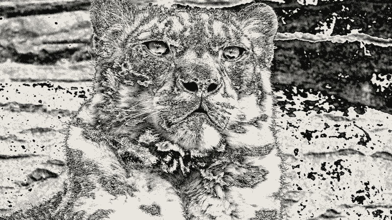 subject: snow leopard · look: atkinson · threshold 0.50 · 1px
Which dither mode is actually best for laser engraving photos?
Pick from the error-diffusion family: Jarvis, Stucki, or Atkinson. LightBurn's Image Mode list also has Ordered and Threshold, but both were built for solid-fill art, not continuous tone, so they lose the midtones a photo depends on. Inside the error-diffusion family, the right pick swaps by material. Atkinson for leather and dark or grained wood. Jarvis or Stucki for anything with a wider tonal range, like light birch, slate, or anodized aluminum.
This guide works material first: what dithering is actually doing to the image before a single dot fires, the four modes LightBurn exposes in Cut Settings, which one to run per substrate, and the baseline power, speed, and DPI numbers you should set before you ever touch the dither dropdown.
What does dithering actually do before the laser fires?
Dithering converts a grayscale photo into a pattern of laser-fireable dots that reads as tone from normal viewing distance. A laser head can't modulate "35% gray" the way a printer head blends ink — on most jobs it's firing on or off at a given point, full stop. Error-diffusion dithering is what makes that binary constraint look photographic. It's a feedback process that pushes each pixel's rounding error onto its neighbors, so the average density across a region still reads as the right shade even though no single pixel is.
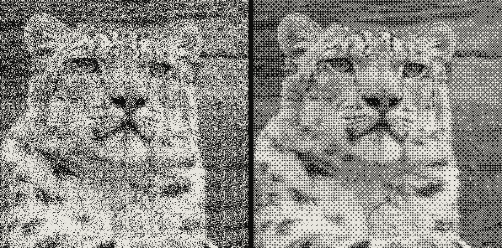 subject: snow leopard · look: blue-noise / bayer · reading order: blue-noise threshold 0.50 1px / bayer 8x8 matrix threshold 0.50 1px
That's also why you can't dither any old way and expect the same photo back. Floyd-Steinberg, the original 1975 version of this idea, spreads error to four neighboring pixels and produces fine, even grain. Jarvis spreads it across twelve pixels one step further out — slower, but it hides more artifacts. Atkinson only pushes three quarters of the error forward instead of the full amount, so highlights and shadows clip instead of fading smoothly.
Run threshold or ordered dithering on a real photo and the failure shows up fast: midtones either disappear into solid black and white blocks, or lock into a visible grid that reads as a screen-door effect instead of a picture. Those two modes are for logos and line art. Keep them there.
What dither modes does LightBurn actually give you?
LightBurn's Cut Settings Image Mode list has more options than most people ever try. Here's what each one is built for:
| Mode | How it handles the image | Best for | Where it fails |
|---|---|---|---|
| Threshold | Binary on/off split at a fixed brightness | Pre-dithered, already two-color art | Any photo: destroys midtones |
| Ordered | Fixed grid pattern of dots | Solid-fill logos, cartoons | Photos: visible grid artifacts |
| Floyd-Steinberg (Dither) | Diffuses 100% of error to 4 neighbors | Fast, bold photo results | Narrow-tonal materials: tries to hold a gradient the material can't burn |
| Jarvis | Diffuses error across 12 neighbors | Smooth photos, portraits, large-format | Slower to process; can look soft on high-contrast subjects |
| Stucki | Jarvis derivative, faster | Slate, stone, anodized aluminum | Less forgiving of a poorly exposed source image |
| Atkinson | Diffuses only 75% of error | Leather, dark or grained wood, high-contrast subjects | Blows out very light or very dark regions |
| Grayscale | Continuous power modulation, no dithering at all | Diode lasers or specially prepped CO2 jobs on leather/polished surfaces | Needs real calibration; not identical across firmware |
Haven't settled the first-order question of diffusion versus a fixed pattern yet? The longer breakdown of Floyd-Steinberg against ordered dithering covers that on its own. For the mechanics of what Atkinson specifically does to the error term, see the full settings breakdown.
Which dither mode should you use for each material?
The material decides how much tonal range actually survives the burn. The dither mode should match that, not fight it.
| Material | Recommended mode | Why |
|---|---|---|
| Wood, plywood, bamboo | Atkinson or Floyd-Steinberg | Grain already adds texture and noise; Atkinson's contrast cuts through it |
| Leather | Atkinson (or Grayscale if your laser supports true power modulation) | Burn is close to binary, dark or invisible; Atkinson's clipping matches that |
| Slate, stone | Floyd-Steinberg or Stucki | Material holds real gradient; Stucki's tonal accuracy preserves shadow detail |
| Anodized aluminum | Stucki | Excellent natural contrast; Stucki gives the finest detail at speed |
| Cardboard, thin paper | Sierra Lite, low power, fast speed | Burn-through risk outweighs any gain from a heavier diffusion algorithm |
| Painted acrylic | Floyd-Steinberg or Burkes | Uniform surface; Burkes' smooth gradients look clean without overworking it |
Riso printers already know this discipline from 1-bit file prep: the output device sets the real constraint, and the file gets built around it rather than around what looks good on a monitor. The 1-bit checklist for sending a file to a riso press solves the identical problem on a different output device.
Here's the failure mode worth naming directly: picking a gradient-preserving mode like Jarvis on a material that can't physically render a gradient — leather, say — doesn't give you a better photo. It just moves the same clipping into uglier, less controlled spots, because the material clips it for you regardless of what the algorithm intended.
What baseline power, speed, and DPI should you start from before touching dither mode?
Set the baseline before you compare algorithms, not after. A reasonable CO2-laser starting point for photo engraving: 200 to 400 mm/s, 10 to 30 percent power, 250 to 350 DPI. The dither mode changes which dots fire. It doesn't change how hard or how fast the laser moves.
DPI (or LPI, depending on your software) is its own tradeoff, and it's a prep decision, not a dither-mode decision. Too low, and fine dot patterns merge into mud. Too high, and you're burning the same spot repeatedly without adding visible detail. Screen printers run the same tradeoff between mesh count and line screen, covered in more depth in the piece on halftone moiré and screen angles — the math of resolution versus output device is identical, even though the output device here is a laser, not a screen.
Before any of this: prep the source image. Raise contrast, darken midtones a touch, confirm the Z-height focus is accurate, clean the material. A well-exposed source photo at the wrong dither mode will usually still outperform a poorly exposed one at the "correct" mode.
Frequently Asked Questions
What's the single best dither mode for laser engraving photos?
There isn't one. Error-diffusion dithering (Jarvis, Stucki, or Atkinson) beats ordered dithering and threshold for any photo with gradients, but which of the three wins depends on the material's tonal range. Atkinson is the safer default on narrow-tonal-range materials like leather and dark wood; Jarvis or Stucki read better on materials that can actually hold a full gradient, like light wood or anodized aluminum.
Why does Atkinson dithering work better on leather and wood than Floyd-Steinberg?
Atkinson diffuses three quarters of each pixel's quantization error instead of the full amount, which pushes the result toward higher local contrast and lets very light and dark areas clip cleanly. On leather, a burn is close to binary: dark or not visible. That clipping behavior matches the material instead of fighting it. Floyd-Steinberg diffuses all of the error and tries to preserve a full gradient the material can't physically render anyway.
Is Grayscale mode better than dithering for photo engraving?
On materials with a wide, controllable tonal range and a laser that supports true power modulation, Grayscale mode varies power continuously instead of converting the image to a 1-bit dot pattern. Several sources recommend it specifically for leather and polished surfaces. It needs more calibration up front and isn't supported identically across firmware, so dithering stays the more portable default.
Do I need different power and speed settings for each dither mode?
The dither mode changes the pattern of dots the laser fires at, not the baseline power and speed curve. Start from the same material baseline, roughly 200 to 400 mm/s and 10 to 30 percent power on a CO2 laser for photo engraving at 250 to 350 DPI, and only adjust from there if a specific mode is over- or under-burning dense dot clusters.
What should I use for a material that isn't on the comparison table?
Default to Atkinson and run a small test grid on scrap first. It's the safer general-purpose choice across the widest range of tonal ranges and grain patterns. If the result looks too contrasty and the material can genuinely hold a gradient, step up to Jarvis or Stucki and re-test.
So which dither mode should you run first?
Start from the material, not the algorithm. Leather or a dark, grainy wood: run Atkinson. Light wood, slate, or anodized aluminum: run Jarvis or Stucki and let the material hold the gradient it's actually capable of holding. Everything else — the baseline power, the speed, the DPI — should already be set before this choice, not adjusted to compensate for it.
Run the same comparison on your own source photo and material in kott's dither studio, with Atkinson, Jarvis, and Stucki preloaded side by side, so you can see the clipping difference before you ever touch the laser.
02/ OUT
Every setting described above is a real control. Open your own image and sweep it.
All journal entries