How to Dither Pixel Art in Procreate on iPad
Procreate has no built-in dither filter, so every pattern is placed by hand. The exact brush and grid settings that keep dithering pixel-perfect in Procreate.
01/ ARTICLE
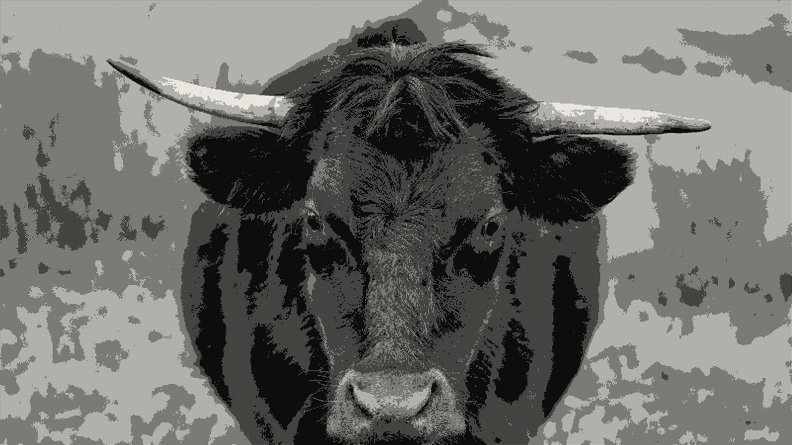 subject: bull · look: bayer · 2x2 matrix · threshold 0.50 · 1px
What is dithering in pixel art, and why do it by hand in Procreate?
Dithering is placing pixels of two colors in a deliberate pattern to fake a third tone, or a smoother gradient step, without adding a new color to the palette. In Procreate, that means drawing it yourself. The app has no one-tap dither filter. Checkerboard, stipple, and line patterns all get placed with a 1px brush on a gridded canvas, one stroke at a time.
That's actually the appeal if you're coming from a touch screen. A dither pattern you draw by hand responds to the same pressure and pencil feel as the rest of a Procreate piece. And the market for third-party dithering brush packs on Procreate's own store isn't small — it shows real, ongoing demand for exactly this workflow. It's a different route to the same destination as dithering an image manually in Illustrator: vector pen tool there, raster pixel brush here, same underlying pattern logic underneath.
How do you set up a Procreate canvas for pixel-perfect dithering?
Start small, and start in pixel units. A practical range for a hand-dithered piece is 64x64 to 256x256px. Set the measurement dropdown to pixels — not millimeters, not centimeters, not inches — at creation time. Pick a physical unit instead, and your grid math silently scales wrong; a "1px" dot you draw later is no longer 1 device pixel, and your checkerboard pattern goes crooked the moment you zoom in.
Leave DPI at the default 300 unless the piece is bound for print. For color profile: sRGB IEC61966-2.1 if the art is headed to the web or a game engine, Display P3 only if the work stays entirely inside Apple's own ecosystem.
Once the canvas exists, turn on the pixel grid. Go to Actions > Canvas, toggle on Drawing Guide, then tap "Edit Drawing Guide" and choose the "2D Grid" tab. Tap the grid size's numerical readout above the slider — not the slider itself — and type an exact pixel value on the popup keyboard. That numeric entry is what lets you dial the grid to a true 1px (or 2px, 4px) spacing, so every dither dot lands on a real pixel boundary instead of drifting half a pixel off-grid.
What brush settings keep a dither pattern pixel-perfect in Procreate?
Four values in the Brush Studio decide whether a dither pattern reads as crisp pixels or soft noise. A pixel-perfect dither brush in Procreate needs Spacing at 100%, Size Jitter at 0%, Position Jitter at 0%, and Rendering set to Uniform. That's the flat sentence worth remembering.
Start from a 1px square brush with a hard pencil tip, not a modified round, soft-edged default — enabling the "Use Pencil Tool" option helps here too. Leave any one of those four values at a soft default and anti-aliasing creeps back in. Spacing above 100% lets strokes blend into each other. Nonzero Jitter randomizes dot size or position off the grid. Non-Uniform Rendering blurs opacity at the edges. You'll see the pattern turn to mush at exactly the setting you left soft — that's the tell when something's wrong.
How do you draw each dither pattern by hand?
Three patterns cover almost everything a dither-by-hand workflow needs. Each has a different visual job.
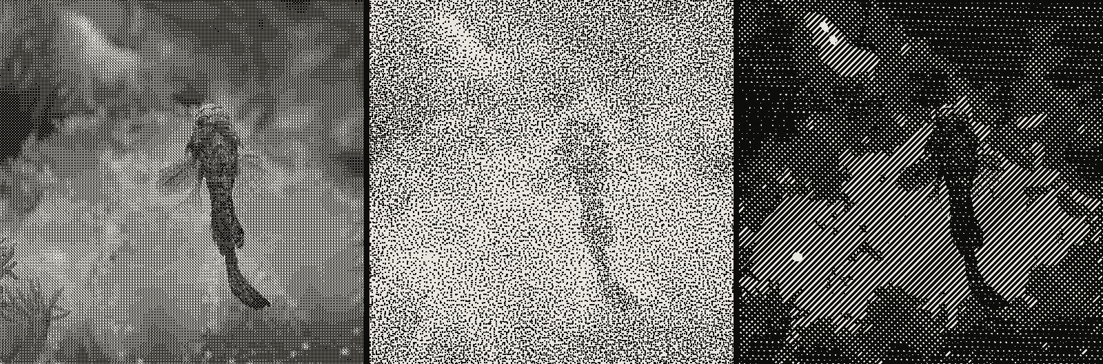 subject: mandarin fish · look: bayer / stipple / crosshatch · reading order: bayer 4x4 matrix threshold 0.50 1px / stipple scale 3px threshold 0.50 dot size 1.3 / crosshatch scale 6px contrast 1.1
Checkerboard alternates one dark pixel and one light pixel in a strict grid — the simplest pattern, mechanically identical to what a 2x2 Bayer matrix produces when an algorithm does the same job instead of your hand. It reads as a flat, even midtone from a normal viewing distance.
Stipple places dark pixels at random, not gridded, positions on a light ground, or the reverse. Density of placement controls how dark an area reads, not a fixed grid — more dots per square inch, darker tone, same two colors throughout.
Line alternates color in diagonal or horizontal bands instead of individual dots. It reads less like a smoothed gradient and more like a screen-print or engraving texture. Useful when that's actually the look you want.
Want to fake a gradient out of any of these? Change dot or line density stroke by stroke as you move toward the shadow side of a form, rather than switching which pattern you're using mid-area. A checkerboard that gets denser toward one edge reads as a gradient. A checkerboard that switches to stipple halfway across just reads as a mistake.
Why does the fill tool ruin a dither pattern?
Procreate's bucket fill tool anti-aliases its edges by default. It's built to blend into surrounding pixels — exactly the opposite of the hard, binary edge a dither pattern depends on. Fill a shape with the bucket tool, then zoom in: the boundary between your dithered area and the rest of the piece shows a faint gradient of in-between colors instead of a clean cutoff.
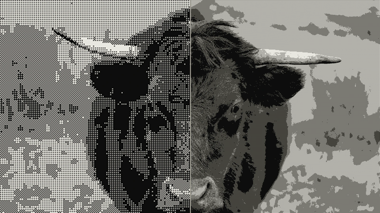 subject: bull · look: bayer · 2x2 matrix · threshold 0.50 · 1px · left: dithered at 400x224 then bicubic-upscaled to 1600x900 · right: dithered at 1600x900
The honest fix is the manual one. Drag a 1px pencil brush across the gridded canvas instead of filling. Slower, yes, but it's the only way to guarantee every pixel on the boundary is fully one color or fully the other. Aseprite's gradient-dithering workflow runs into the same fill-tool problem from a different app — any raster editor with a soft default fill blurs a dither pattern the same way.
Procreate manual dithering vs kott's dither engine
| Procreate (manual) | kott | |
|---|---|---|
| Setup time per image | Minutes to hours, depends on pattern density | Seconds — upload, pick a look, export |
| Pattern control | Full hand control over every dot's placement | Algorithm-level control (threshold, matrix size, kernel) |
| Algorithms available | Checkerboard, stipple, line — whatever you can draw | Floyd-Steinberg, Atkinson, Bayer 2x2/4x4/8x8, blue-noise, and more |
| Consistency across 100 images | Varies with hand and fatigue | Identical settings apply exactly every time |
| Best for | One-off pieces where the hand-drawn feel is the point | Batches, photo-accurate dithering, exact algorithm reproduction |
Procreate wins when the point of the piece is that a person drew it — nothing automatic beats a trained eye deciding where a stipple dot belongs. kott wins the moment you need an algorithm nobody can draw accurately by hand, applied consistently across more than one image.
How does kott reproduce the same dither patterns automatically?
Each manual pattern in this guide has a direct algorithmic equivalent. Checkerboard is a 2x2 Bayer matrix. Line patterns map to ordered dithering at a fixed angle. Stipple maps to kott's own stipple effect, which places dots using the same random-but-density-controlled logic you were approximating by hand — just computed exactly, instead of eyeballed.
Want to see the difference on a real photo without drawing a single pixel? kott's dither tool runs all of these live, settings visible and adjustable. No popup, no email gate. Just the effect loaded and ready to compare against what you drew.
Frequently Asked Questions
Does Procreate have a built-in dither filter?
No. Procreate has no one-tap dither filter — every pattern (checkerboard, stipple, line) is placed by hand with a 1px brush on a gridded canvas, or with a third-party dithering brush set that still requires manual strokes. That manual requirement is exactly why the settings in this guide matter.
What canvas size should I use for pixel art dithering in Procreate?
Start small and in pixel units — 64x64 to 256x256px is the practical range for a hand-dithered piece. Set the unit dropdown to pixels at creation time; a canvas created in inches or centimetres scales the grid math wrong once you try to snap a 1px dither dot to it.
Why does my dither pattern look blurry instead of crisp pixels?
Almost always one of three brush settings: Spacing above 100%, or Size/Position Jitter above 0%, or Rendering left on a soft default instead of Uniform. Any of the three lets Procreate blend or anti-alias each dot, which destroys the hard edges a dither pattern depends on.
Can you dither a gradient the same way you dither a flat fill?
Yes — the only difference is pattern density. A flat dither alternates colors in a fixed ratio across the whole area; a dithered gradient increases the density of the darker color stroke by stroke as it moves toward the shadow side, which is what fakes a smooth transition out of two flat colors.
Does kott do anything a hand-dithered Procreate piece can't?
Procreate wins on direct artistic control over where a dot lands — nothing automatic beats a trained eye placing stipple by hand. kott wins on the algorithms nobody can draw by hand: real Floyd-Steinberg error diffusion, Bayer matrices at 2x2, 4x4, and 8x8, and blue-noise dithering, applied to a full photo in one pass instead of pixel by pixel.
Conclusion
Dithering in Procreate is a manual, settings-dependent skill. Get the canvas units right, the grid spacing right, and four specific brush values right, and that's what separates a crisp checkerboard from a smear. There's no filter to fall back on — which is exactly why the method is worth learning properly.
Once you can tell a 2x2 Bayer checkerboard from a stipple pattern on sight, kott's automatic version stops looking like magic. It's the same decisions you just made by hand, run at any resolution, in one pass, every time.
02/ OUT
Every setting described above is a real control. Open your own image and sweep it.
All journal entries