Large-Format Halftone Dot Gain: Setting LPI, DPI and Scale Without Moire
Dot gain darkens midtones, resolution only needs to be 1.5 to 2 times the LPI, and moire comes from resampling a file that is already screened. Here are the…
01/ ARTICLE
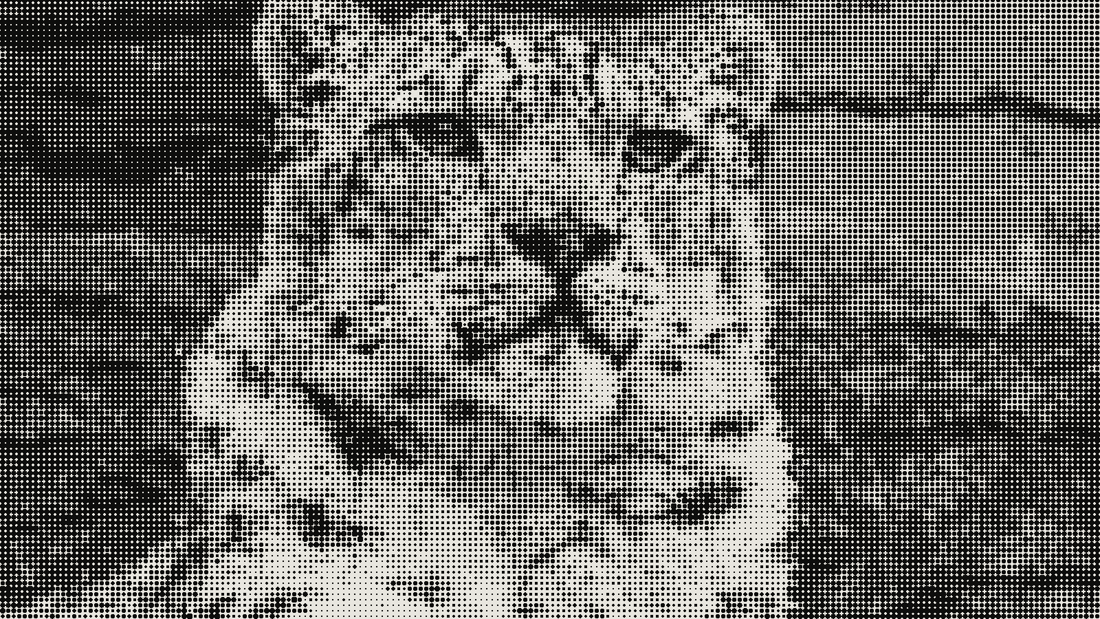 subject: snow leopard · look: halftone · cell 8px · angle 45° · shape circle · Image made with kott.io
Introduction
At large format, plan for three things: dot gain from the substrate, an image resolution of 1.5 to 2 times the screen's LPI, and a rule against resampling any file that is already screened. Dot gain darkens your midtones on press, extra resolution beyond about 2.5 times the LPI is thrown away, and resampled halftone bitmaps are where moire comes from. It's written for the person about to send a file to a wide-format or screen printer. You get numbers to check against the printer's spec, not rules to take on faith.
What is dot gain, and why does it get worse with fine screens?
Dot gain is the increase in a halftone dot's printed area compared with the dot in your prepress file, so printed images come out darker than intended. Wikipedia gives the formula as DG = printed area minus prepress area. A 30% dot that prints at 50% has 20% total gain, and a 40% tint with 19% gain prints at 59%.
Gain is not the same across the tone range. It is greatest in the 40 to 60% midtones, and above that the dots touch, which cuts the edge length available for ink to spread. Printers usually measure it with a densitometer at the 40% and 80% tones.
The causes are physical. Ink spreads around the dot, and uncoated paper absorbs more ink than coated paper, so absorbent stock gains more. Printing pressure squeezes ink outward. In offset there is also rimming, where ink collects at the dot edge, and halation of the film during exposure.
Finer screens make this worse for a geometric reason: a smaller dot has more edge for each unit of area, and ink spreads at the edge. That is why newsprint, a low-density stock with high gain, runs at about 85 LPI while commercial magazines on coated glossy stock can go up to 300 LPI. At large format you usually choose a coarser screen than a magazine, which keeps gain manageable and keeps the dots visible from a distance.
The failure you will see is midtones going heavy and shadows plugging up. If a face looks fine on screen and muddy on the banner, gain in the 40 to 60% range is the first thing to check. For how this plays out on textile, see DTF and DTG halftone LPI ranges.
How do I set the LPI and DPI for a large-format halftone?
LPI is the frequency of the halftone screen, DPI is how many dots the output device can place per inch, and image ppi is the resolution of your file. They are three different numbers, and the one you control in the file is ppi.
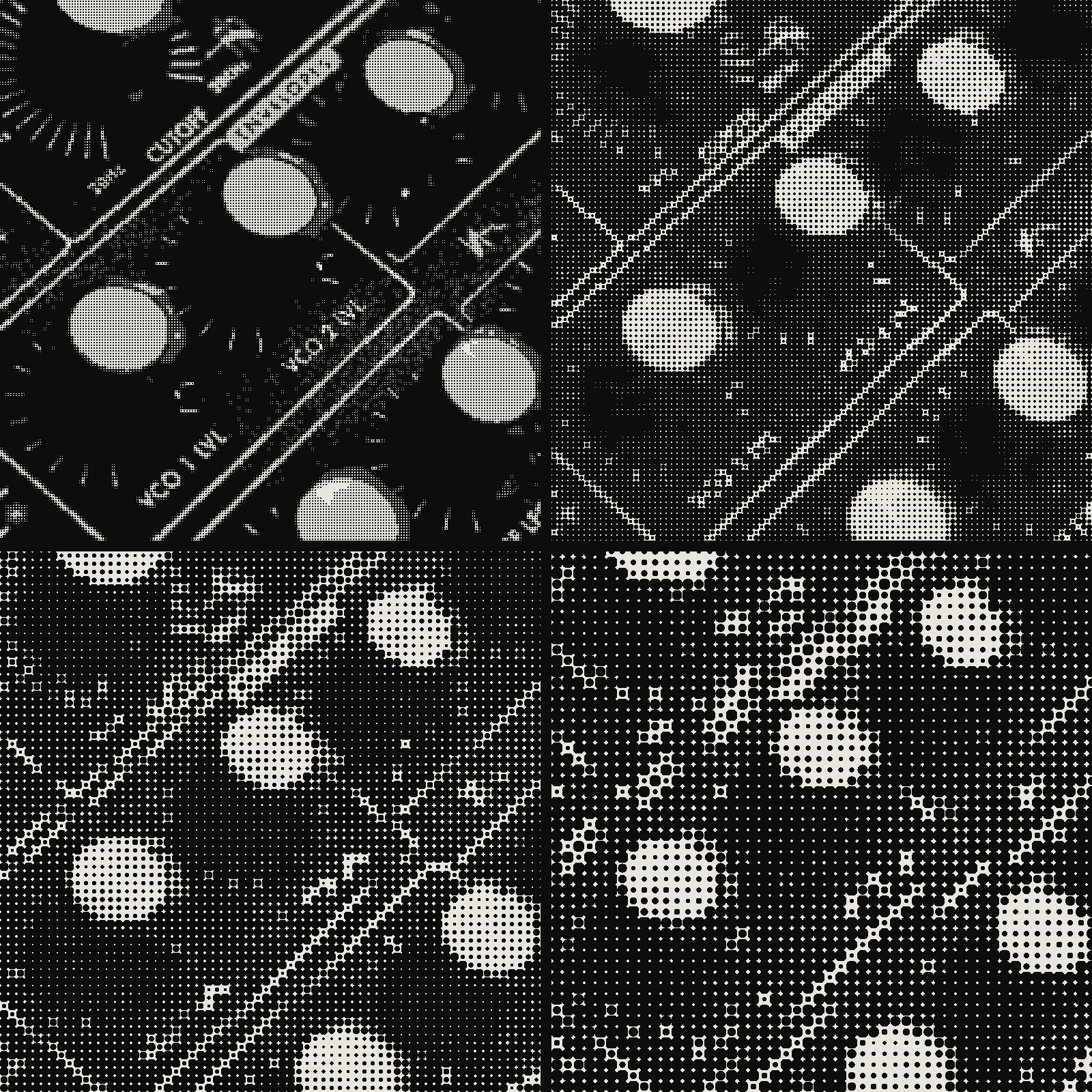 subject: synth knobs · look: halftone · angle 45° · shape circle · reading order: cell 4px / cell 8px / cell 12px / cell 16px · Image made with kott.io
The rule has a floor and a ceiling. A screen printing trade article states that image information above 2.5 times the halftone frequency is redundant, so at 65 lpi anything over about 163 ppi is discarded. Its author recommends at least 1.5 times the frequency, noting that some sources cite 2 times and that you can go as low as 1.25 times. The Lines per inch entry gives the same working range of 1.5 to 2 samples per inch for each line of the screen.
The table below applies those multipliers. The ppi values are plain arithmetic on the LPI, so treat them as targets at final print size.
| Screen (LPI) | Floor at 1.5x (ppi) | Common at 2x (ppi) | Redundant above 2.5x (ppi) |
|---|---|---|---|
| 45 | 67.5 | 90 | 112.5 |
| 65 | 97.5 | 130 | 162.5 |
| 85 | 127.5 | 170 | 212.5 |
| 100 | 150 | 200 | 250 |
| 150 | 225 | 300 | 375 |
Two caveats. Type and thin lines need more resolution than halftone imagery: the same trade article reports that a 300 dpi file renders type edges better than a 200 dpi file, and that fine lines rendered well at up to 400 dpi. And the LPI itself is the printer's choice, set by the device and the stock, so ask for it before you size the file. You can preview how coarseness reads with the halftone generator by stepping the cell size.
How much dot gain should I expect, and how do I compensate?
Expect a measurable midtone gain on every substrate, and measure it on your device instead of borrowing a number. One published reference point is about 23% gain at the 40% tone for a 150 lpi screen on coated paper. A coarser screen on absorbent banner media won't match that figure, in either direction. Treat a reference value as a starting point.
Printers compensate with a tone reproduction curve, a machine-specific curve applied in prepress that lightens the tones so the printed result lands on target. The practical workflow is:
- Build a step wedge in 10% increments from 10% to 90% at the LPI and angle you will use.
- Print it on the real substrate with the real ink set.
- Measure the printed value at the 40% and 80% steps, then read the rest of the wedge by eye if you have no densitometer.
- Subtract the gain from each step to build the curve, and apply it to the final file or ask the printer's RIP to apply it.
If you work with a print shop, ask whether the RIP already applies its own dot gain curve. Applying yours on top will double the correction.
How do I scale a screened file without moire?
Scale the continuous-tone source and screen it at final size; never enlarge or shrink a bitmap that is already halftoned. A halftone screen only behaves when its dot spacing and angle are exact, and resampling moves both.
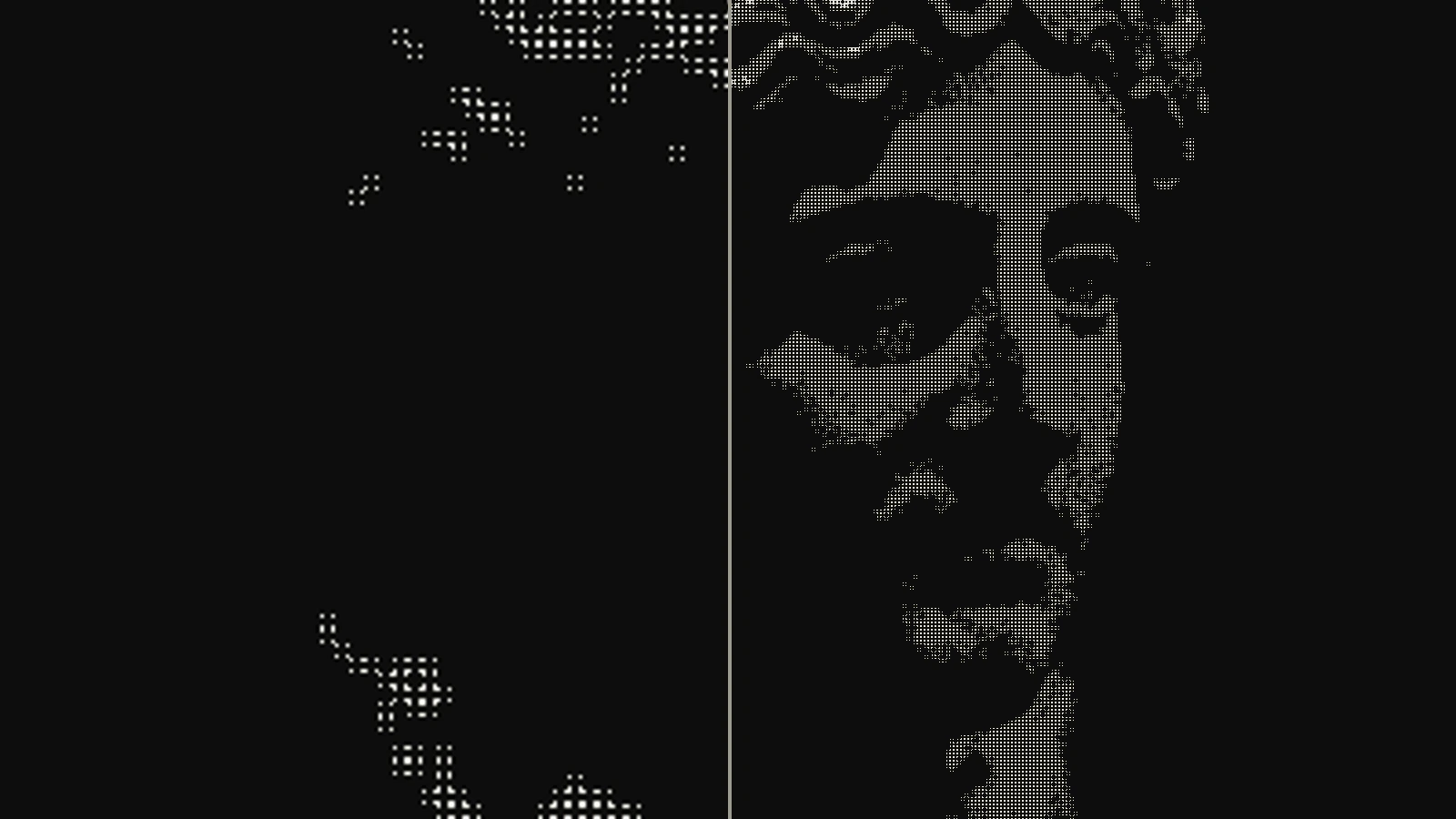 subject: greek statue · look: halftone · cell 4px · angle 45° · shape circle · left: dithered at 400x224 then bicubic-upscaled to 1600x900 · right: dithered at 1600x900 · Image made with kott.io
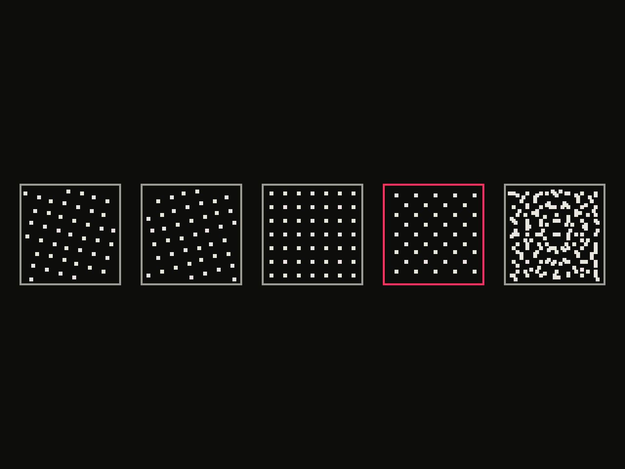 diagram · halftone screens at 15°, 75°, 0°, 45° and their overlay (last panel); outlined: the 45° screen · seed 11
Moire is the pattern that appears when two regular grids overlap at nearly the same period or angle. The moire pattern article notes that separations use different screen angles for this reason, and that scanning a printed halftone can add moire of its own. If your only source is a printed piece, descreen it first, then re-screen.
Angle sets are a printer-side decision. Adobe lists C 105, M 75, Y 90 and K 45 as a standard set commonly used in offset, and also says the exact values vary by press and RIP configuration and that some devices override the defaults. Check with your service provider for the angles and frequencies they want. The older 15, 75, 0 and 45 degree arrangement is the classic reference, but do not assume your device uses it.
Upsampling has its own ceiling. The trade article above says increases of about 25% or less interpolate smoothly, while larger jumps cause color shifting and edge pixelation. At large format that matters: a 4x enlargement of a screened file coarsens the dots and softens their edges, and the result looks like mud from close range. For the wider problem of enlarging bitmap artwork, see taking 1-bit artwork to A1 and bigger.
When should I skip dot angles and use FM screening?
Use frequency-modulated (stochastic) screening when angle moire keeps coming back, because it has no fixed angles to collide. The moire article says FM screening removes screening moire since the four colors are no longer screened at four angles. Dot gain behaves differently with FM, and fine random dots can gain more than conventional ones, so print a proof strip before committing a large run. Stochastic screening vs halftone compares the two in detail.
What should I check before I send the file?
Run this list on the file before it leaves your hands:
- Final print size and viewing distance are written down, and the printer has confirmed the screen LPI.
- Image ppi at final size sits between 1.5 and 2 times that LPI, and no higher than 2.5 times.
- Type and line art are at 300 dpi or more at final size, or kept as vectors.
- The artwork was screened once, at final size, from a continuous-tone source.
- You asked whether the RIP applies its own dot gain curve, and you have a measured curve from a step wedge if it does not.
- You have proofed a strip on the real substrate at the 40% and 80% tones.
To test how a screen reads at different cell sizes before you commit, open the halftone effect in the kott studio and step the cell size and angle against your own image.
Frequently Asked Questions
What is dot gain in large-format printing?
Dot gain is the increase in a halftone dot's printed area compared with the dot in your file. A 30% dot that prints at 50% has 20% gain. It peaks in the 40 to 60% midtones and is higher on absorbent stock.
What LPI should I use for a banner?
Ask the printer, because the screen is set by the device and the substrate. Once you know it, supply image resolution of 1.5 to 2 times that LPI at final size, so a coarse screen needs only a modest resolution.
Can I resize a halftone bitmap in Photoshop?
Avoid it. Resampling a screened bitmap changes the dot spacing and angle, which is what produces moire. Rescale the continuous-tone source, then screen it at final size.
Does 300 dpi matter for a large print?
It matters for type and line art, which need more resolution than halftone imagery. Photographic areas only need 1.5 to 2 times the screen frequency, and anything past 2.5 times is discarded.
Images in this article were made with kott.io.
02/ OUT
Every setting described above is a real control. Open your own image and sweep it.
All journal entries