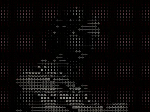
dither text effect
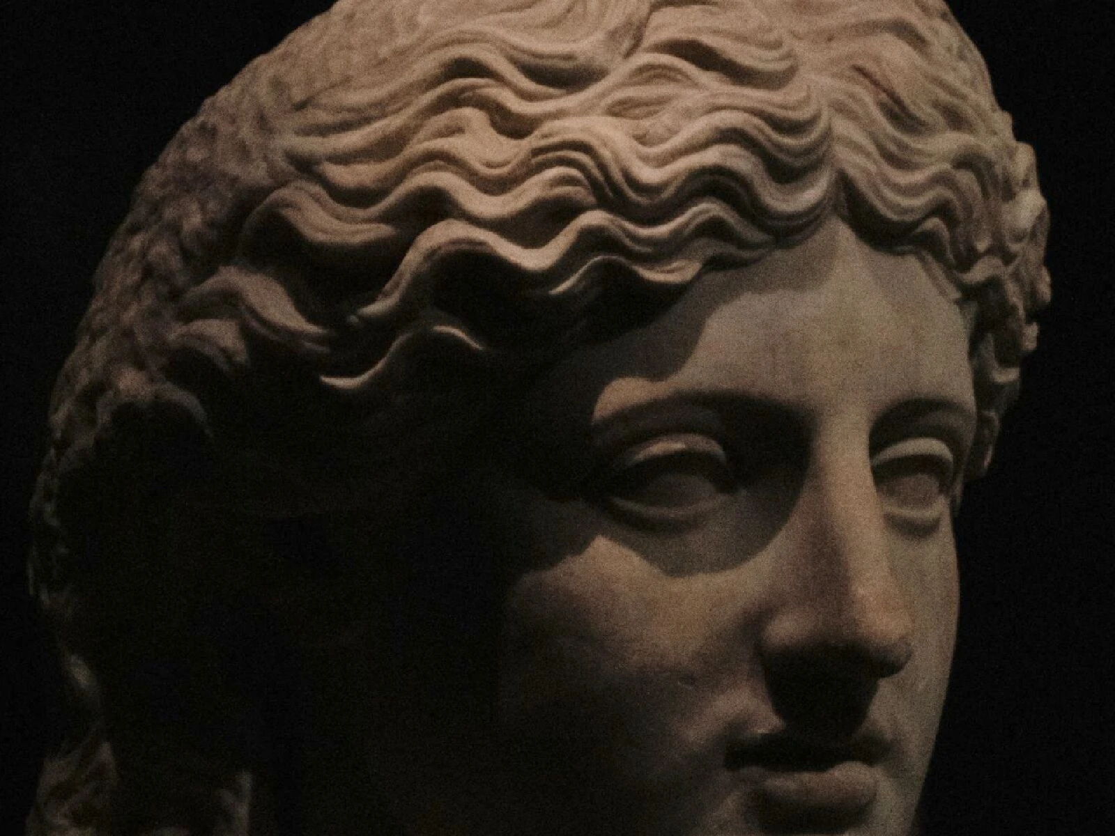
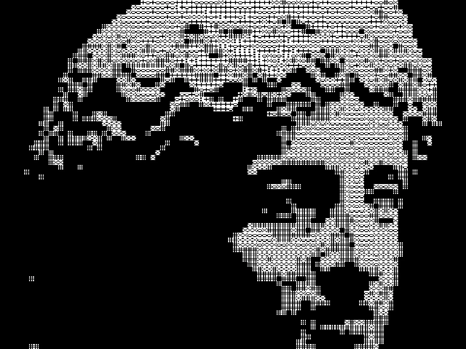 SourceEffect
01/ ORIGIN
Dithering needs marks of varying coverage, and it does not care what shape they are: any set of glyphs ordered by how much ink they lay down will serve. That equivalence is why typewriter art, ASCII art and halftone printing all arrive at similar results from different directions. Using type as a dither pattern makes the substitution explicit rather than incidental, treating the alphabet as a set of pre-made density stamps.
02/ SWEEP
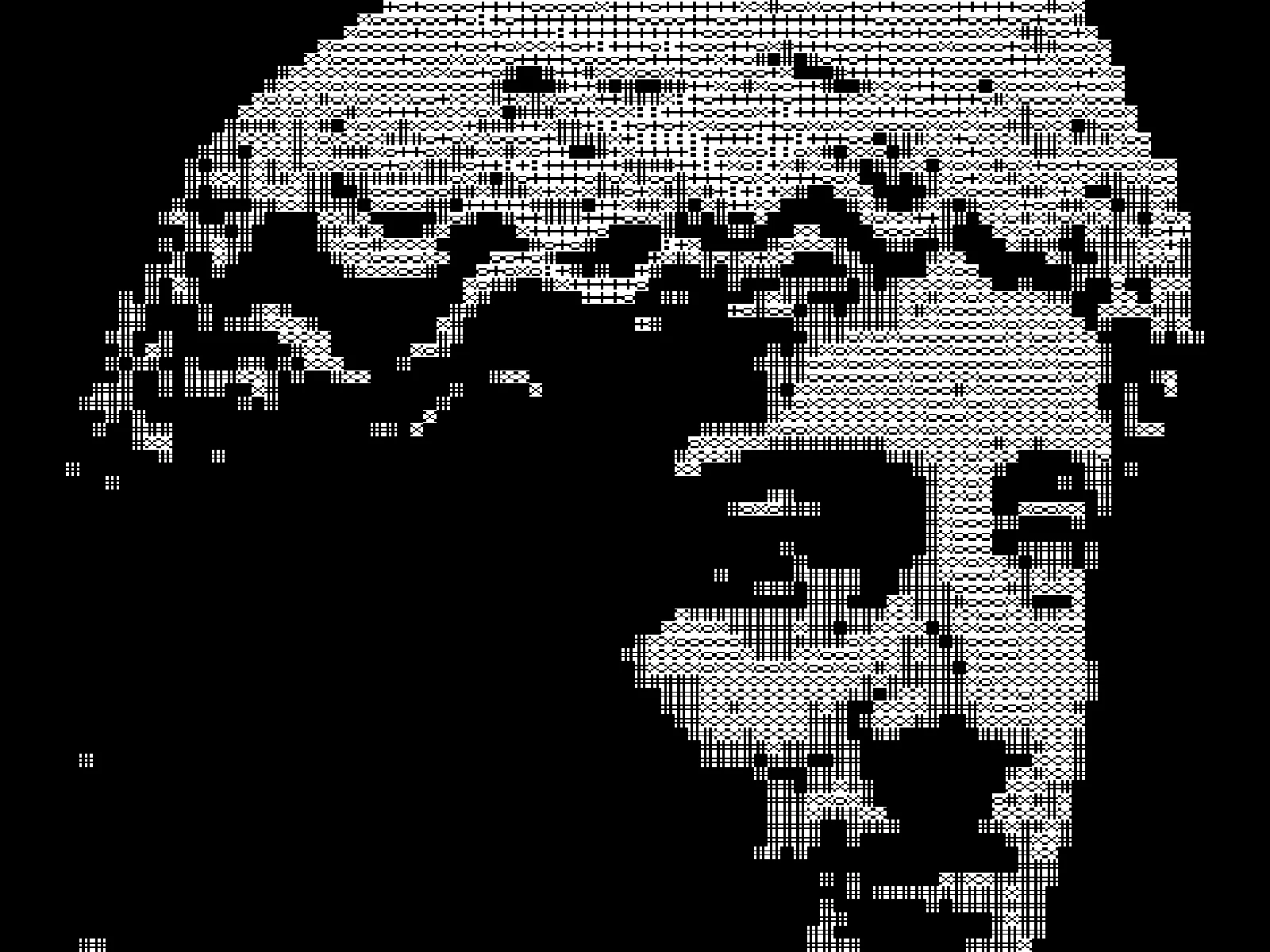
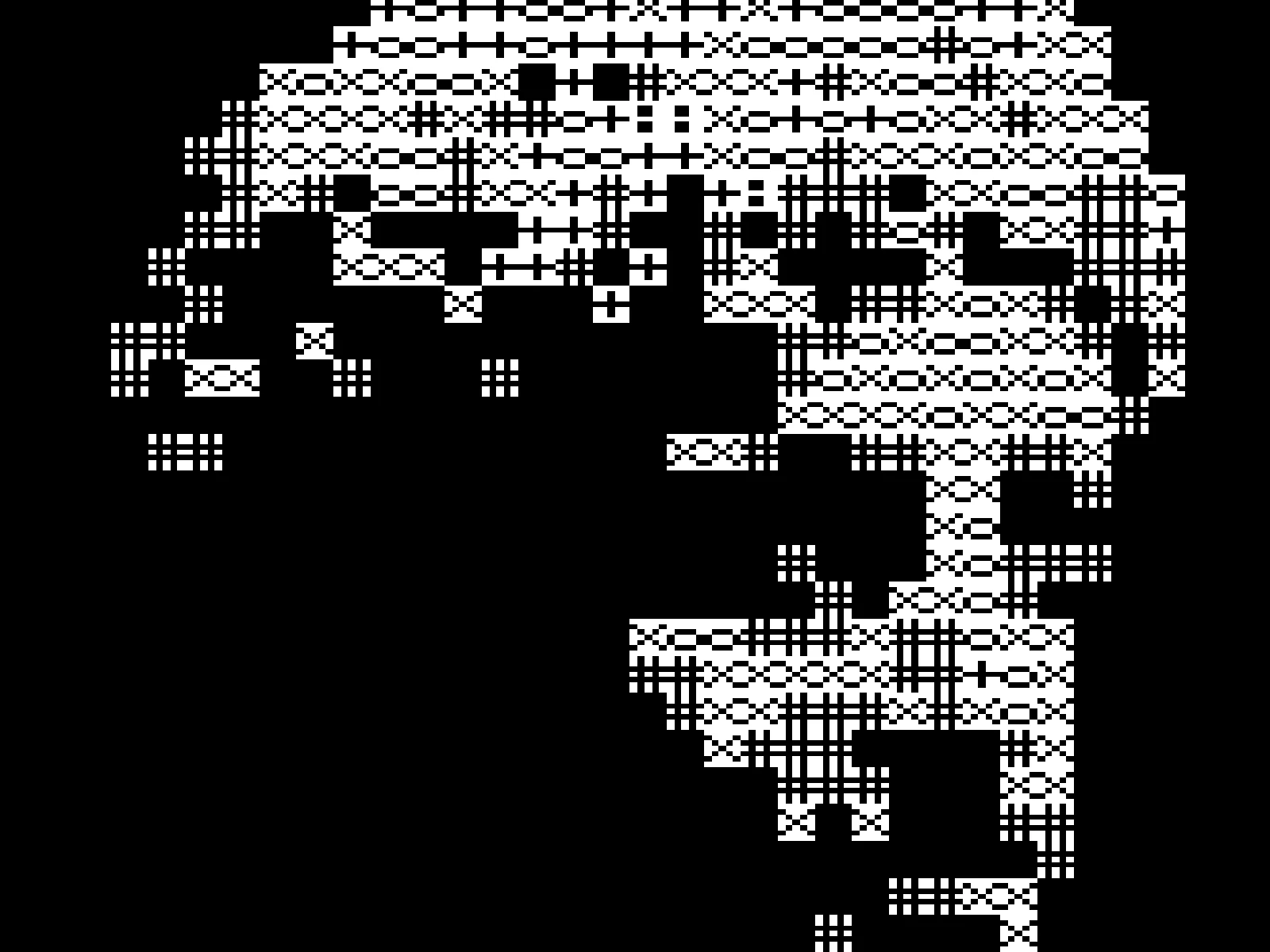
CELL sweep
03/ SPEC
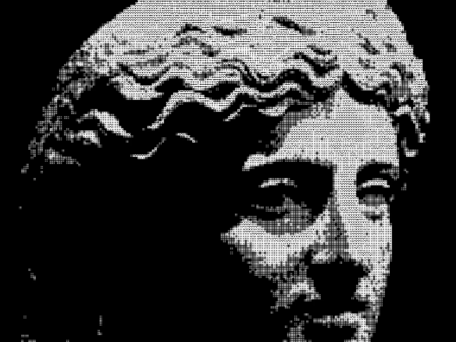
This effect thresholds the image and renders the result with letterforms as the mark, so tone is carried by which glyphs are placed rather than by dot size. CELL runs from 5 to 28 pixels with a default of 10 and sets the glyph cell, controlling legibility against detail. CONTRAST expands tone before thresholding, which matters because a narrow range maps to too few distinct glyphs. INVERT swaps the mapping so dense glyphs land in highlights instead of shadows. In kott the glyph atlas is rasterised on the GPU, so the output is an image rather than selectable text.
04/ FAQ
- What is a dither text effect?
- It uses letterforms as the mark in a dithered image, so tone is carried by which glyphs get placed rather than by varying dot size.
- How is this different from ASCII art?
- ASCII art matches a character to each cell's average brightness. This applies a dither threshold first, so glyph placement follows the dither pattern rather than the tone directly.
- What does INVERT do?
- It swaps the density mapping, so dense glyphs land in the highlights and sparse ones in the shadows. The result reads as white type on dark rather than the reverse.
05/ OUT