effects · text
text effects
01/ VERSE
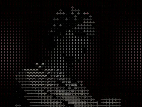
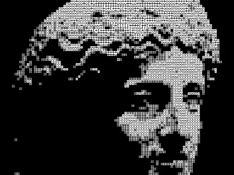
Text effects rebuild a picture out of characters that already mean something else. Every mark arrives with a job and is given a second one. The letter does not stop being a letter while it is being a shade of grey, which is why these read at two distances and never quite settle at either.
02/ SPEC
Text effects use glyphs as the mark that carries tone, choosing characters by ink coverage rather than drawing dots or lines. kott's text family runs from plain ASCII through coloured ANSI-style output to glyph-based dithering, each with a cell-size control that trades legibility against image detail. Reach for this category when a picture should read as having been typed rather than photographed: terminal aesthetics, zine and demo-scene reference, or any brief where the medium is the point. All of them rasterise a glyph atlas on the GPU, so the export is an image and not selectable text, and all of them need real tonal separation to pick distinguishable characters.
03/ EFFECTS