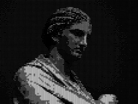
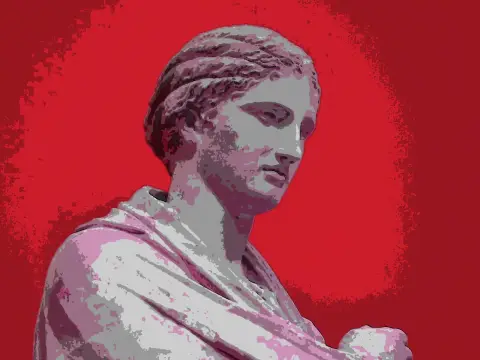
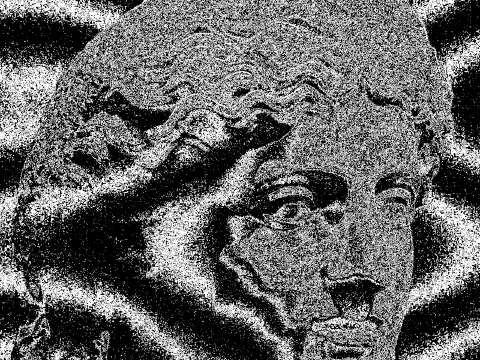
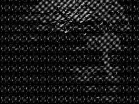
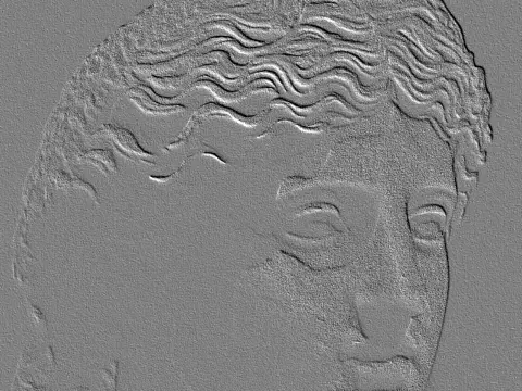
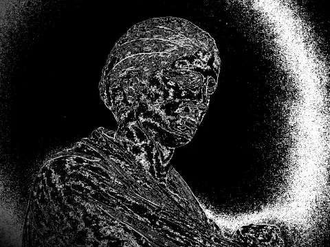
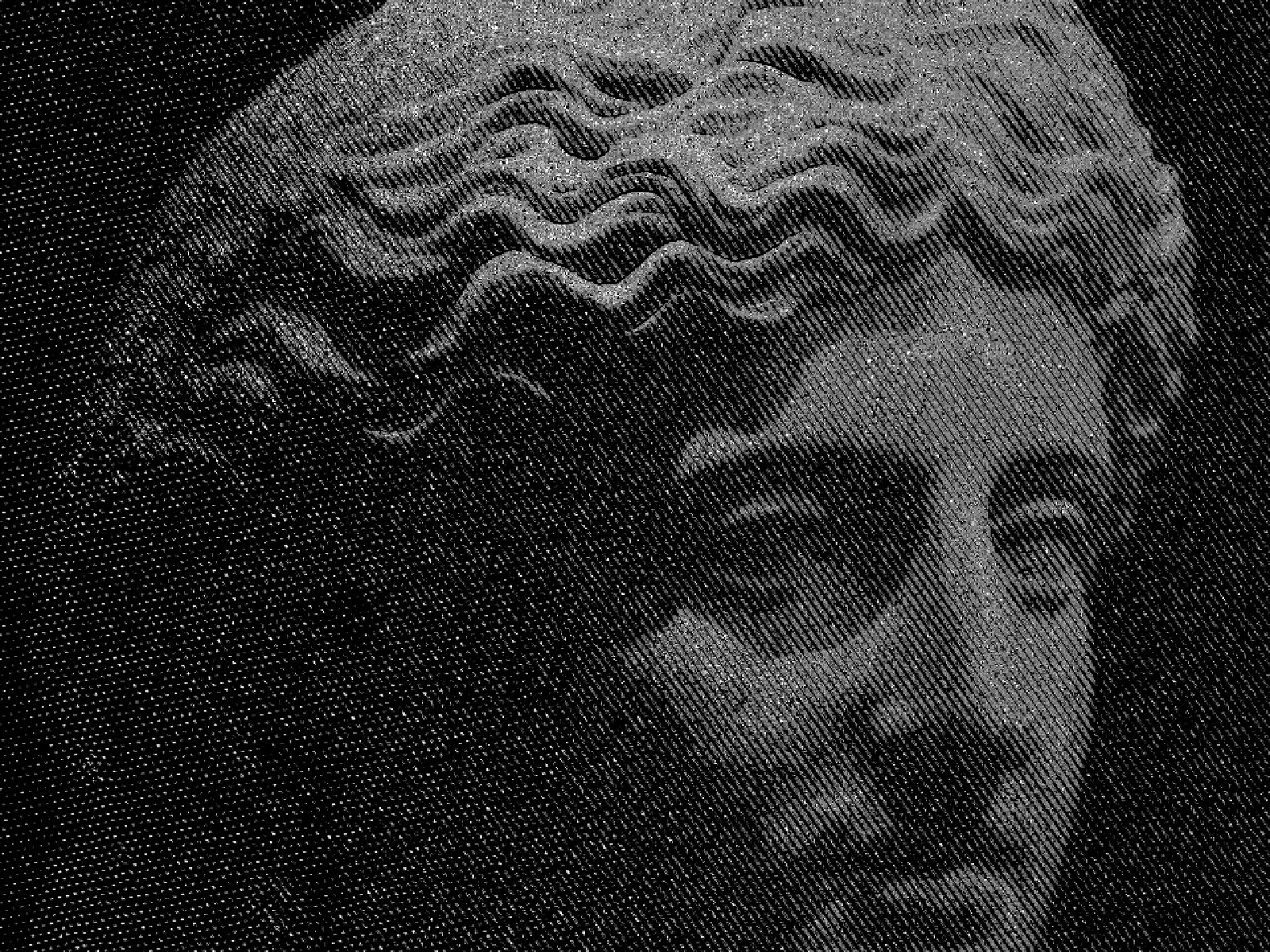
engraving effect
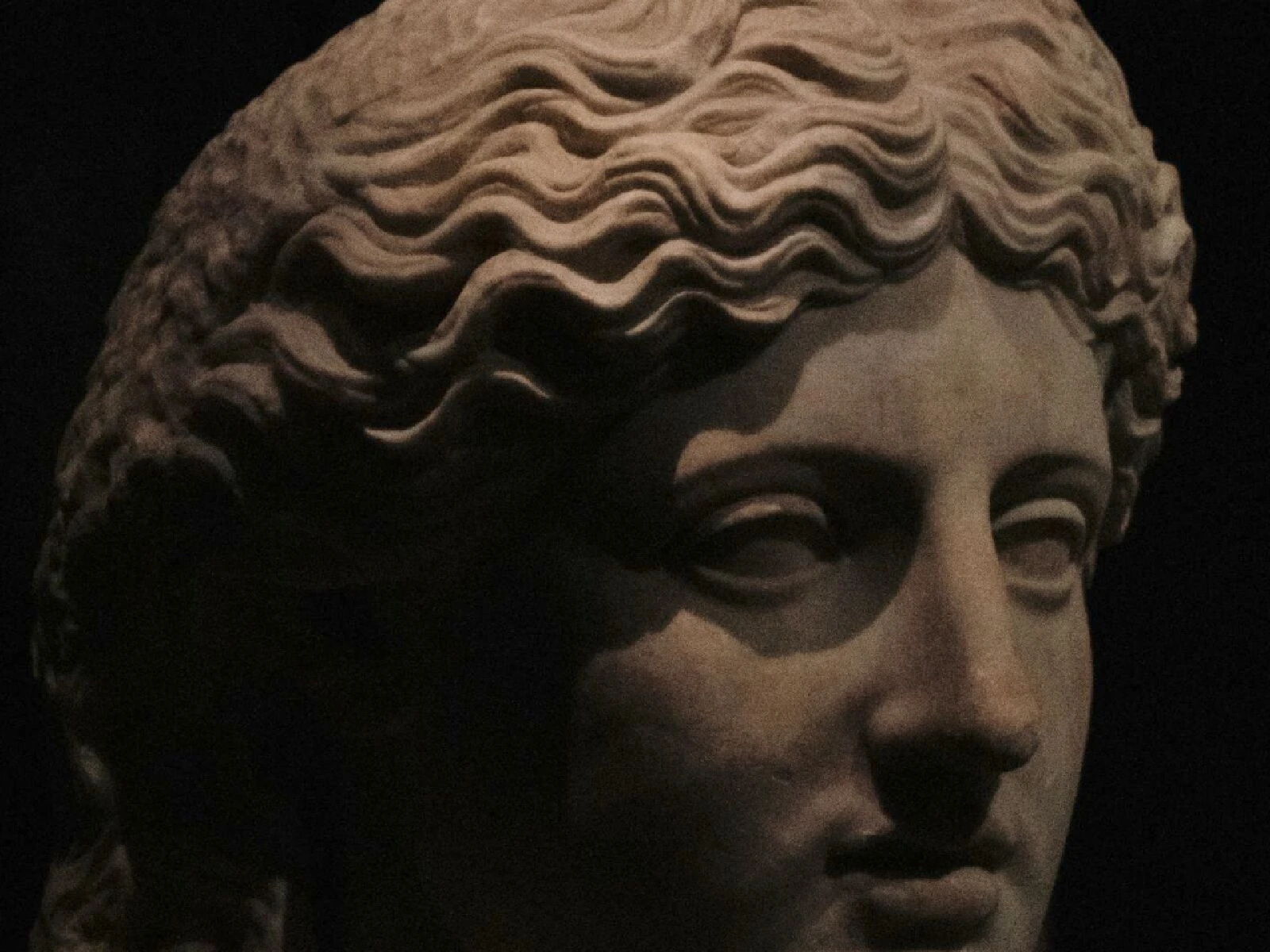
 SourceEffect
01/ ORIGIN
Line engraving cut the image directly into copper with a burin, one furrow at a time, and every tone had to be carried by the width and spacing of those furrows. It became the standard for reproducing paintings, maps and portraits for three centuries, and it survived into modern currency for the same reason it was hard to do: an engraved line is difficult to forge and impossible to photograph cleanly. Look closely at any banknote.
02/ SWEEP
PITCH sweep
03/ SPEC
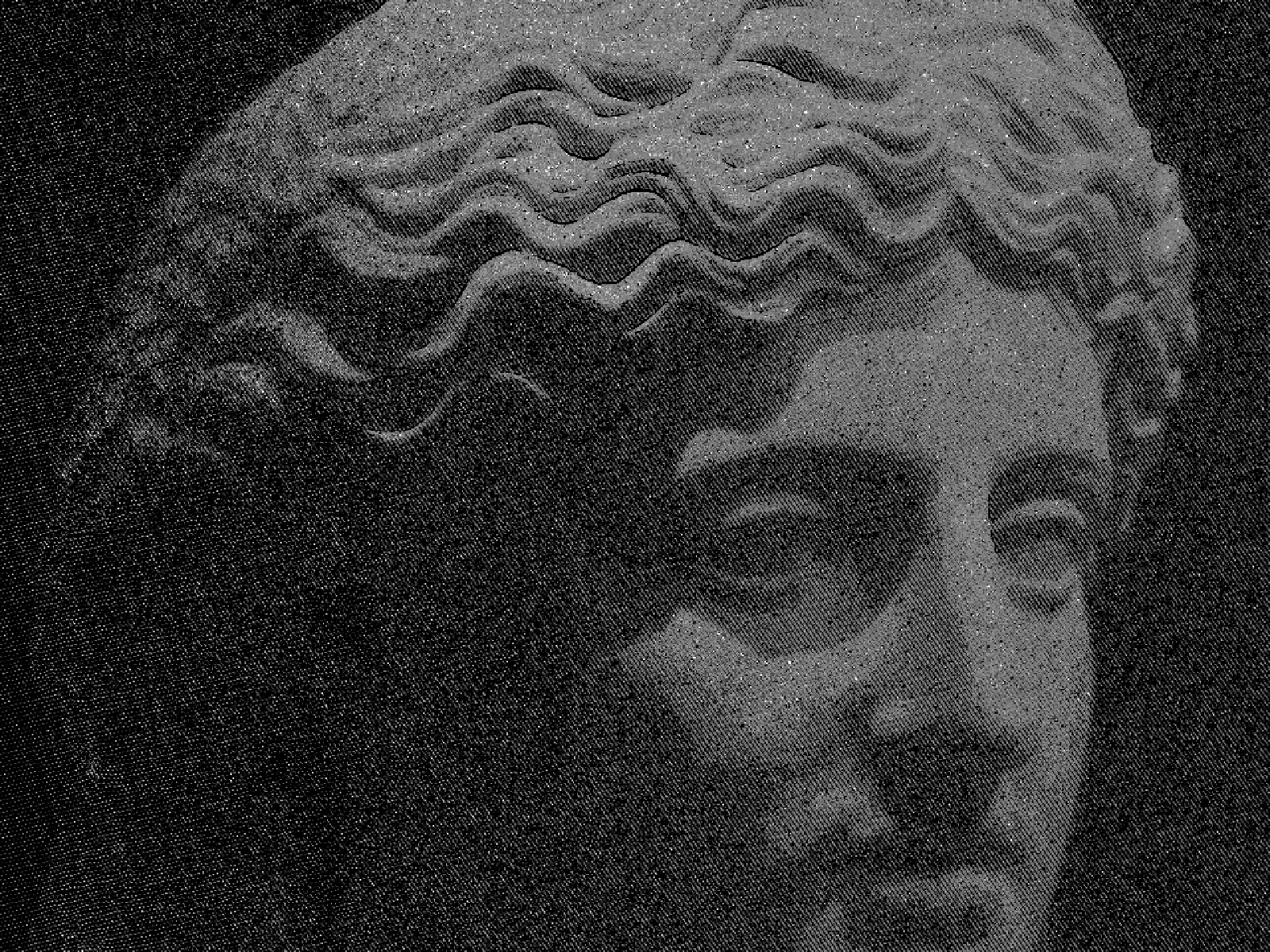
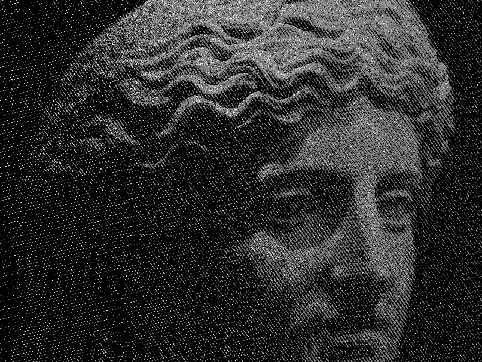
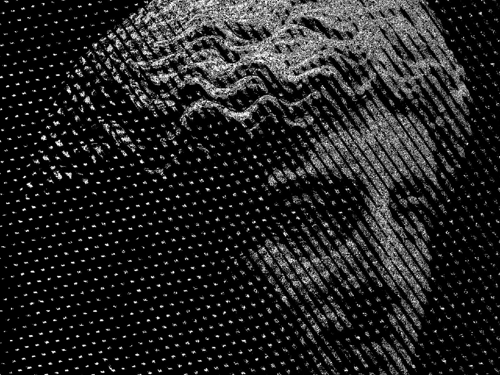
This effect quantises the image into tonal steps and renders each as a line of varying weight, so darker regions receive thicker and more closely packed strokes. LEVELS runs from 6 to 24 with a default of 8 and sets how many distinct line weights the tonal range is divided into, which is what separates a crisp engraved plate from something closer to a continuous wash. PITCH sets line spacing from 3 to 20 pixels, and EDGE THRESHOLD is an advanced control for how strongly contours break the line. In kott the lines are generated per pixel, so they stay hairline sharp at any export size.
04/ FAQ
- What is an engraving effect?
- An engraving effect renders tone as lines of varying thickness and spacing, the way a copper-plate engraver carried shadow with the width of a cut furrow rather than with grey ink.
- What is the difference between engraving and crosshatch?
- Crosshatching builds tone by layering separate sets of strokes at different angles. Engraving varies the weight and spacing of lines running in one direction, which is why it reads as cut rather than as drawn.
- What LEVELS value gives a banknote look?
- Keep LEVELS high, around 16 to 24, with a low PITCH. Currency engraving uses many closely spaced weights, which is what makes the tone look continuous while staying entirely line.