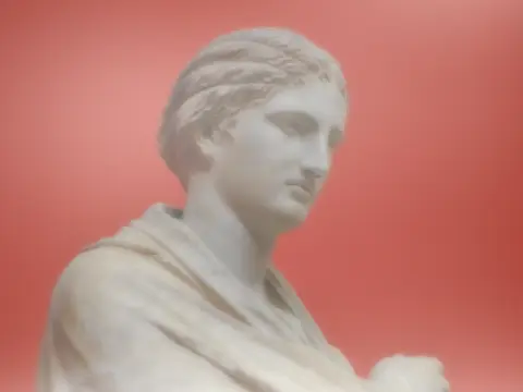
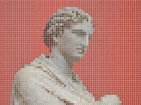
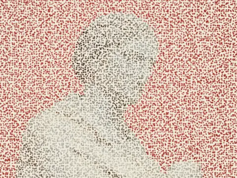
watercolor effect
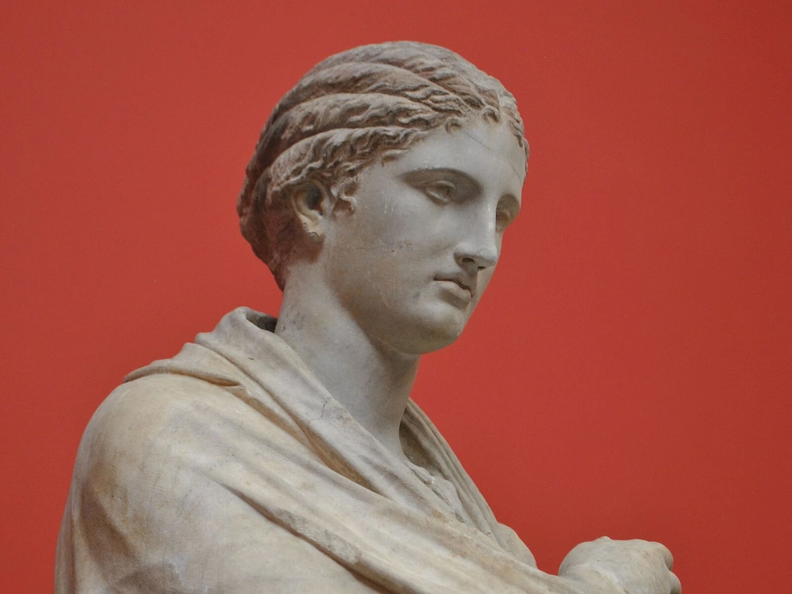
 SourceEffect
01/ ORIGIN
Watercolour is the oldest painting method still in general use and the least forgiving, because nothing can be covered up. Its defining marks are physical rather than stylistic: pigment carried outward by water settles at the drying boundary, leaving the darker rim painters call a wet edge, and granulating pigments drop into the paper's tooth. The English school of the eighteenth and nineteenth centuries built an entire vocabulary out of controlling those two behaviours rather than avoiding them.
02/ SWEEP
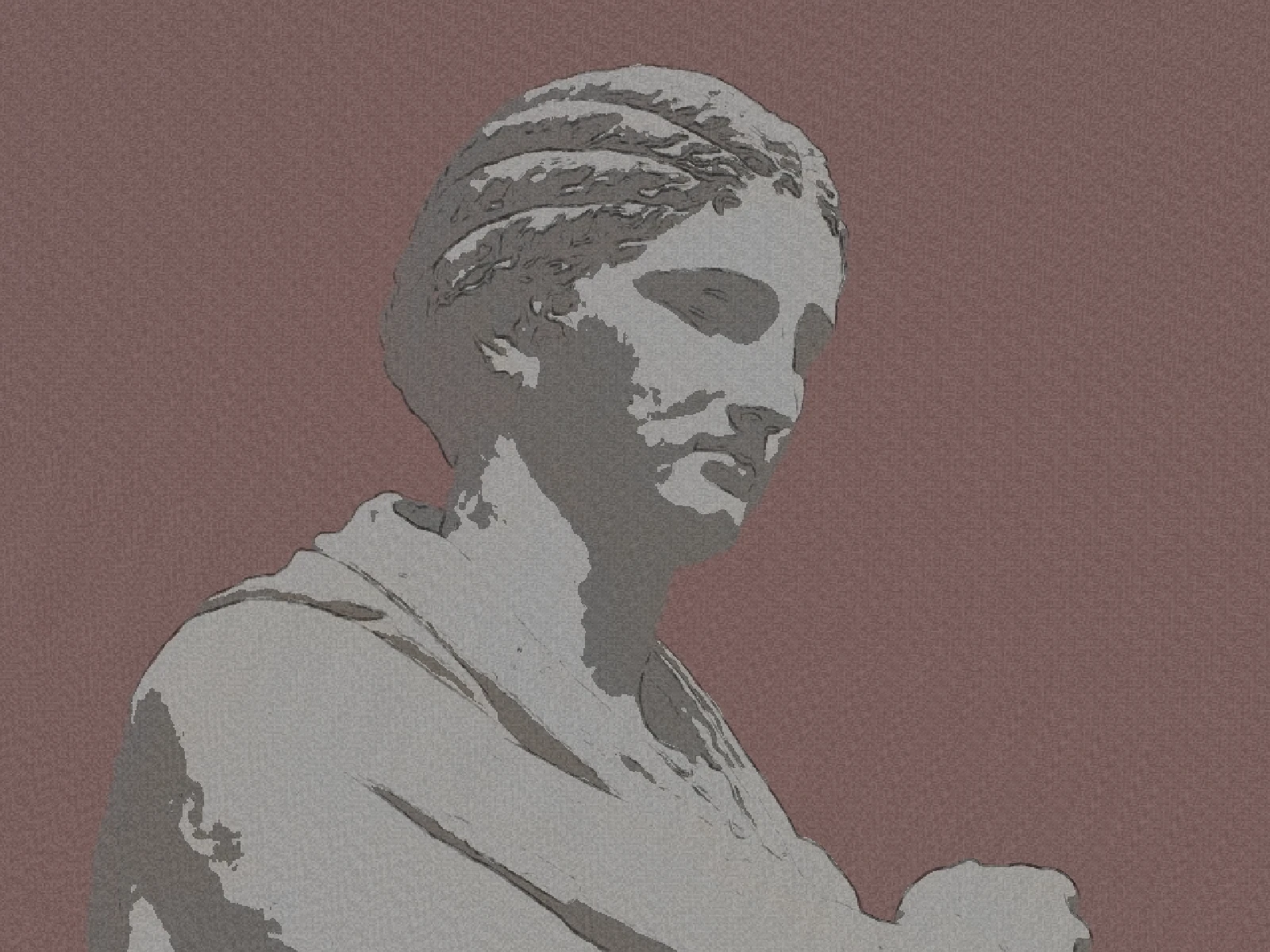
CONTRAST sweep
03/ SPEC
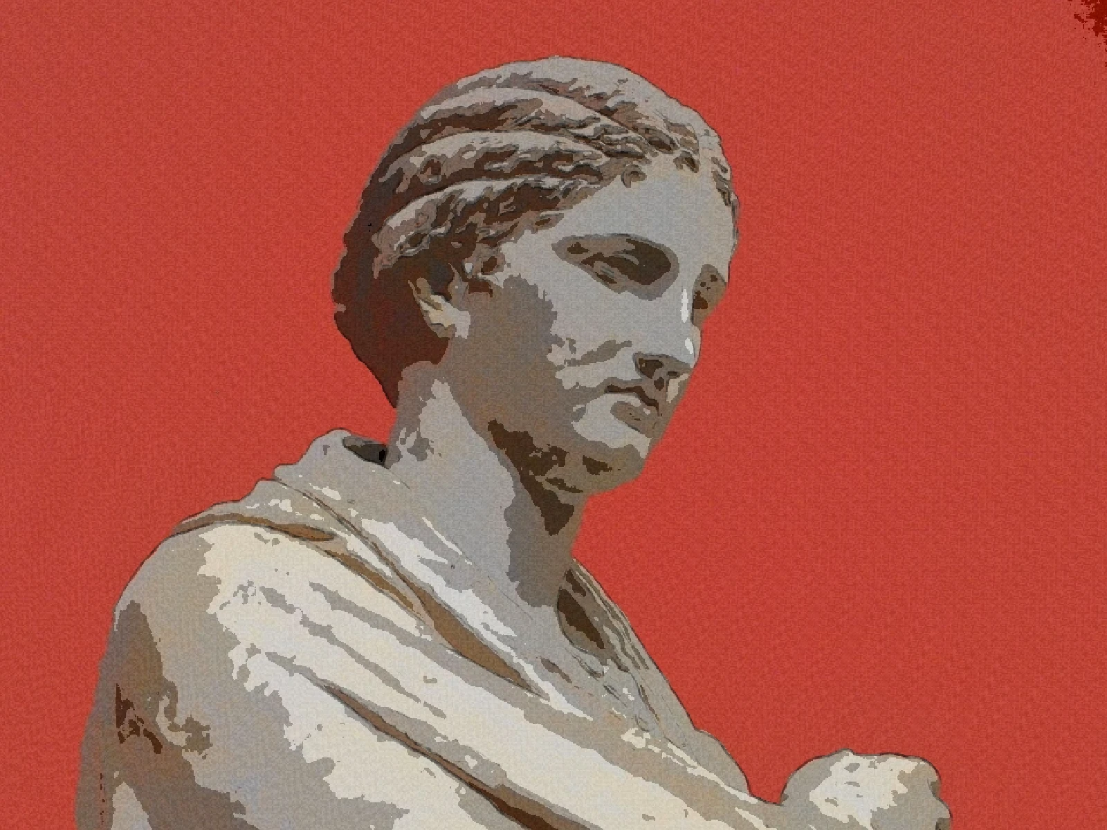
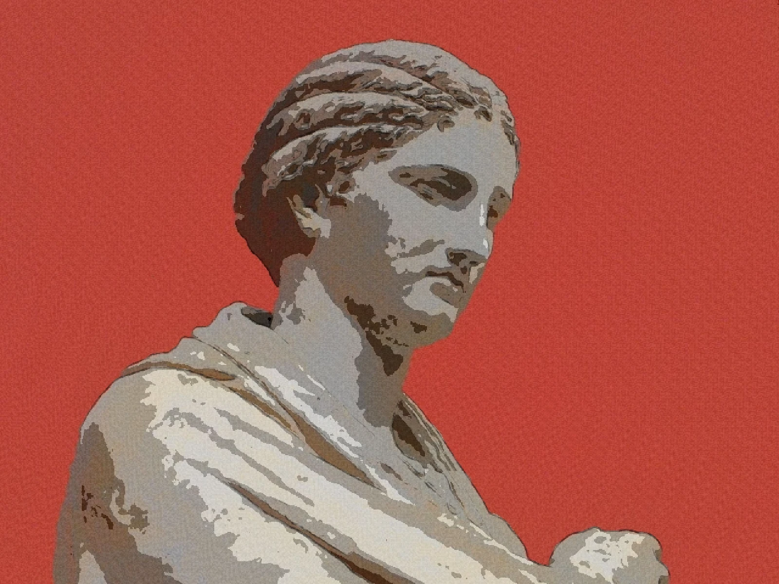
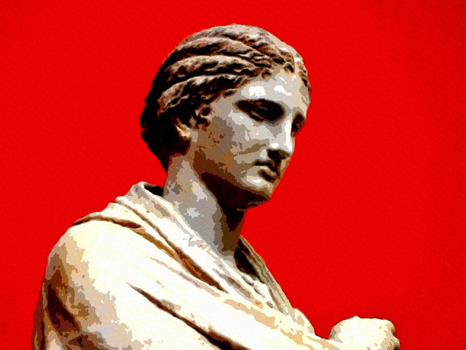
This effect quantises tone into flat washes and reinstates a darker line at the boundary between them, imitating pigment settling at a drying edge. SCALE runs from 1 to 8 pixels with a default of 2 and sets the size of the wash regions, controlling how loose or tight the painting reads. LEVELS from 3 to 10 sets how many distinct washes the range is divided into, and CONTRAST from 0.2 to 3 expands tone beforehand, which on a low-key source is what determines whether separate washes form at all. WET EDGE from 0 to 2 controls the darkness of the boundary line, which is the single control that makes the result read as watercolour rather than as posterisation. In kott the edges are derived per pixel from the wash boundaries themselves.
04/ FAQ
- What is a watercolor effect?
- A watercolor effect pools tone into flat washes and adds a darker line where each wash meets the next, imitating how pigment settles at the edge of drying water.
- What makes a watercolor effect look real rather than posterised?
- The WET EDGE control. Flat tonal bands alone read as posterisation; the darker rim at each boundary is the physical signature of watercolour and is what the eye recognises.
- What SCALE should I use for a loose watercolour look?
- Four and above gives broad pooling suited to a loose sketch. Keep SCALE at 1 or 2 when the subject needs to stay recognisable, since large washes swallow facial detail quickly.