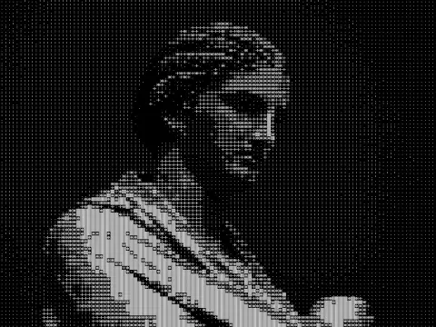
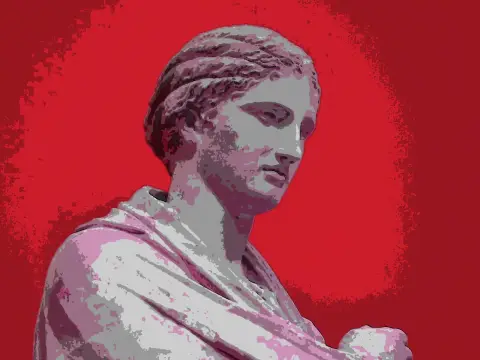
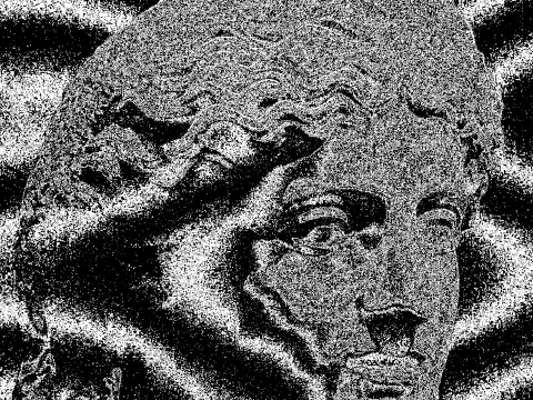
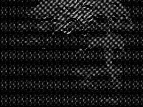
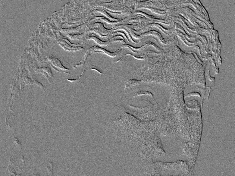
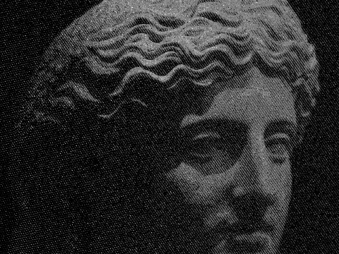
pencil sketch effect
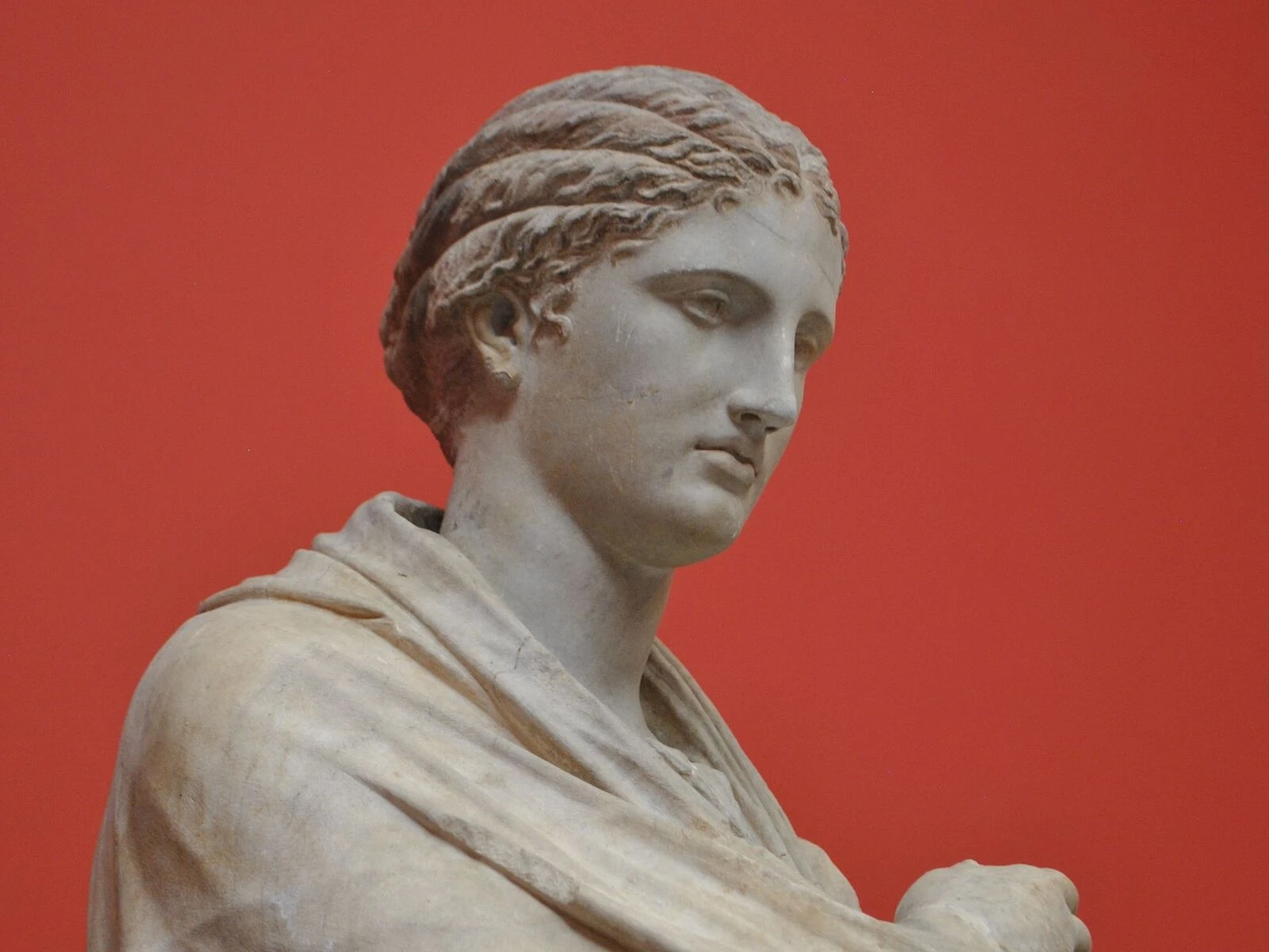
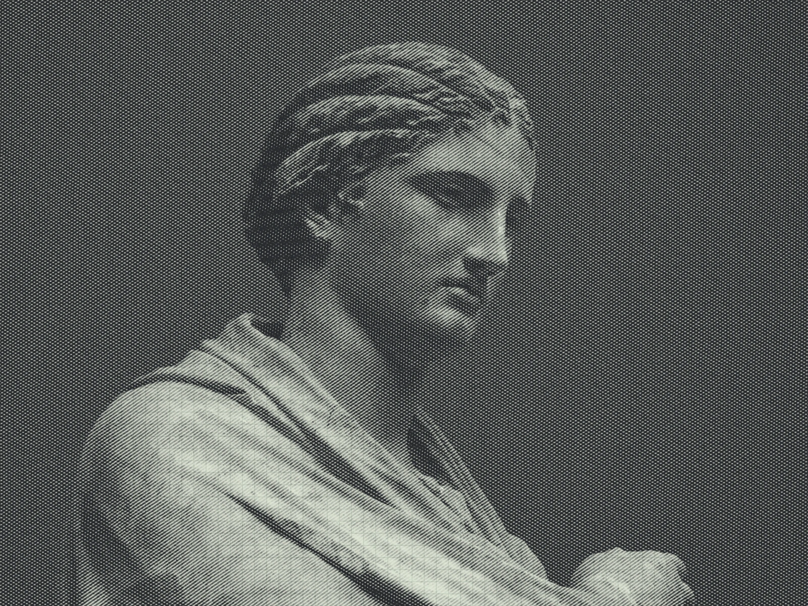 SourceEffect
01/ ORIGIN
Pure graphite came out of one place: the Borrowdale deposit in Cumbria, found in the sixteenth century and so valuable it was guarded and rationed. Everyone else worked with inferior substitutes until Nicolas-Jacques Conté, cut off from English graphite by the Napoleonic blockade, ground what he had with clay and fired it in 1795. That accident produced the modern pencil and, more usefully, gradeable hardness: the ability to choose in advance how dark a stroke would be.
02/ SWEEP
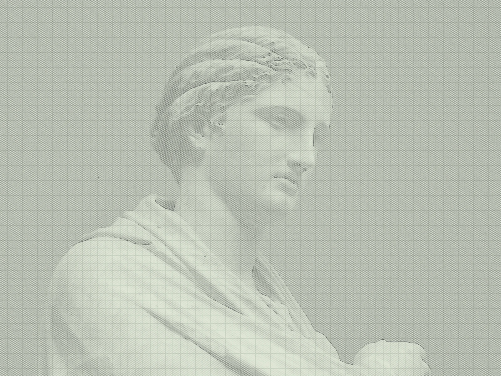
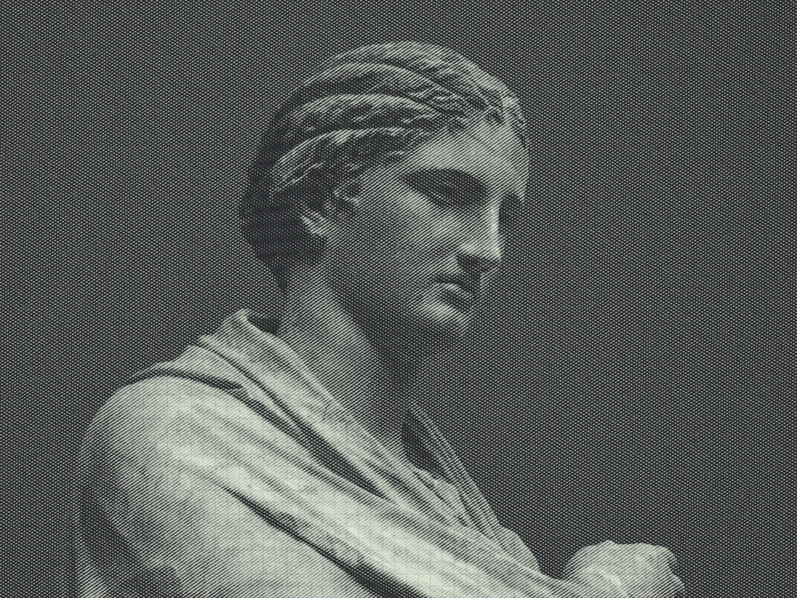
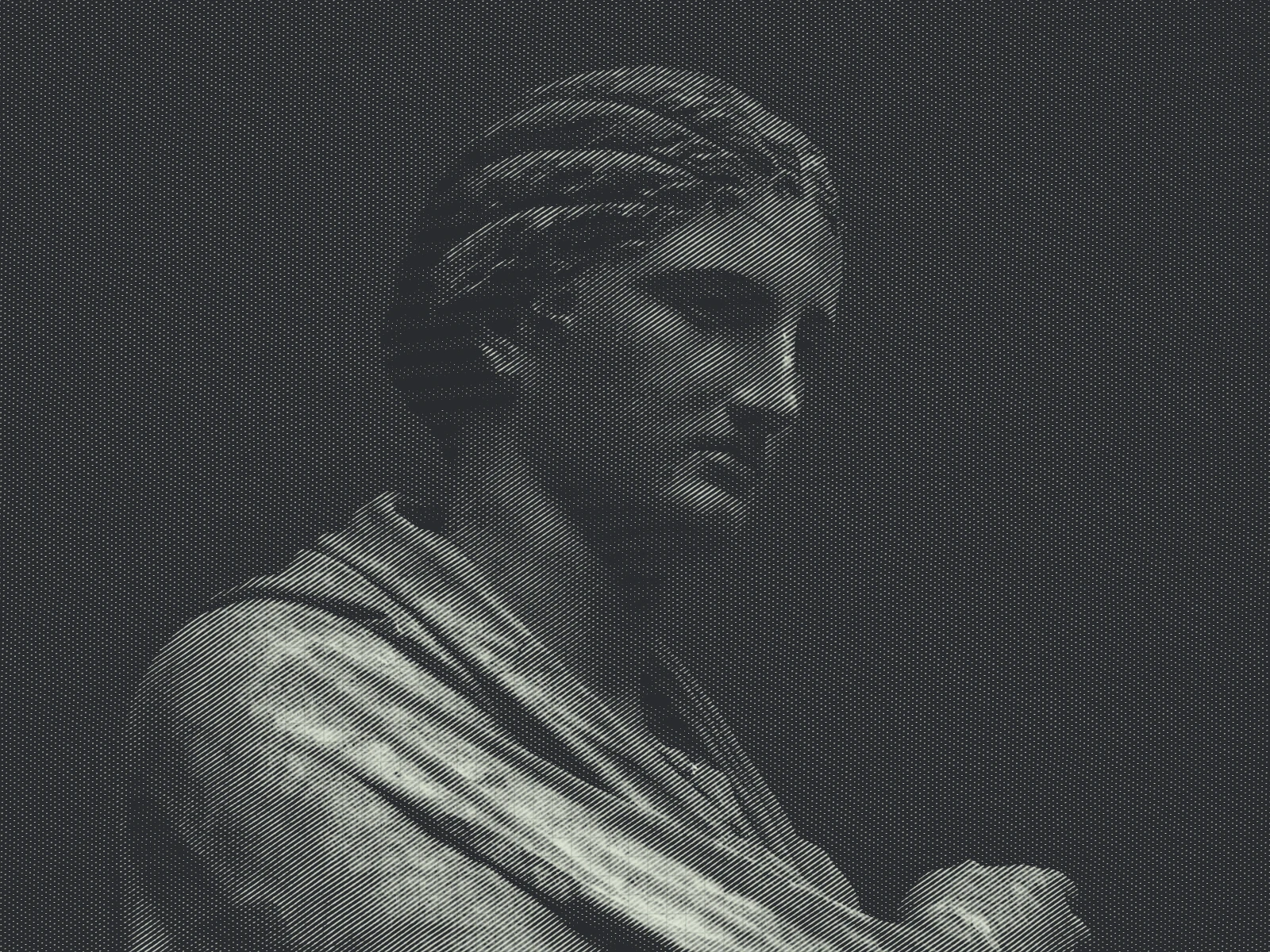
STROKE DARK sweep
03/ SPEC
This effect derives edges and tonal hatching from the image and composites them onto a tinted paper ground with grain, rather than simply inverting and blurring. STROKE DARK runs from 0.2 to 2 with a default of 1 and scales how heavily the graphite reads, which is the closest analogue to pencil pressure. HATCH DENSITY controls how many tonal strokes are laid down, EDGE isolates contours, and GRID with GRID OPACITY overlays a construction grid. PAPER TINT, GRAIN and SOFTNESS build the substrate. In kott every layer is generated per pixel, so the paper texture does not tile across a large export.
04/ FAQ
- What is a pencil sketch effect?
- A pencil sketch effect rebuilds a photograph as graphite strokes on toned paper, deriving contour lines and tonal hatching from the image rather than simply inverting and blurring it.
- How do I make a pencil sketch look hand drawn?
- Keep STROKE DARK near 1, raise GRAIN and PAPER TINT so the substrate reads as real paper, and leave GRID OPACITY low but not zero. A visible construction grid suggests a hand that measured.
- Why does my pencil sketch look like a photo negative?
- That happens when edge detection dominates and no tonal hatching is present. Raise HATCH DENSITY so tone is carried by strokes rather than only by outlines.