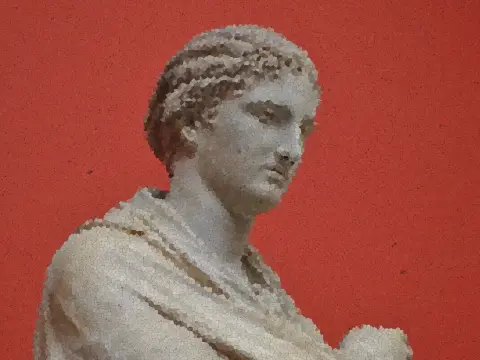
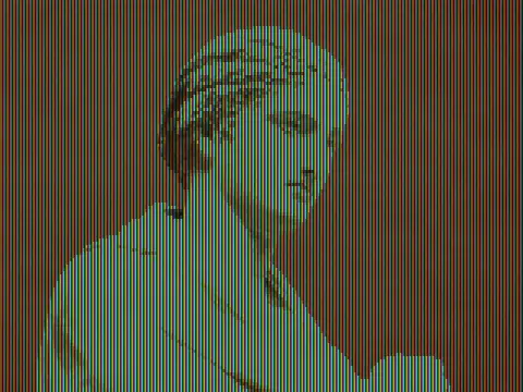
word mosaic effect
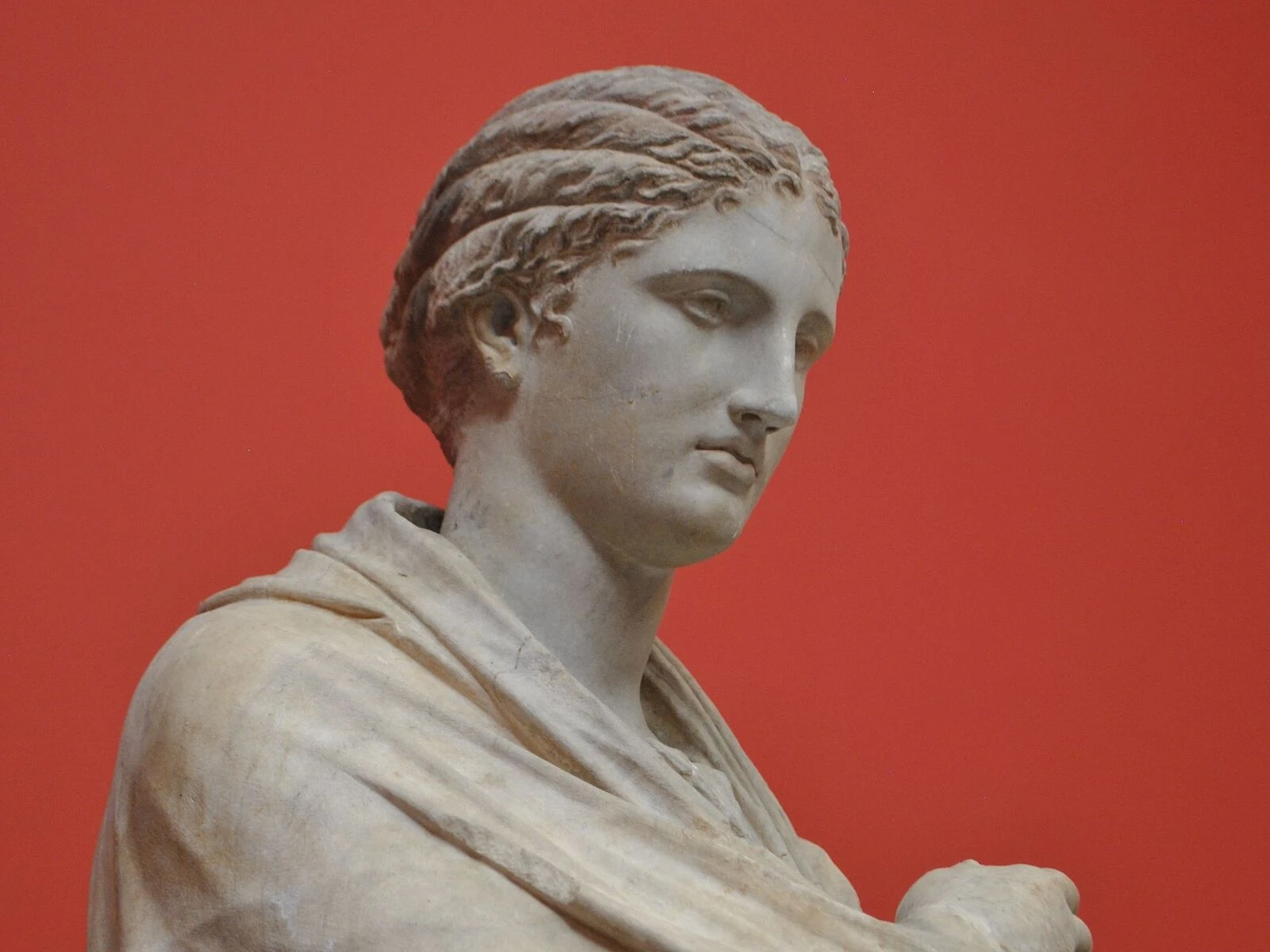
 SourceEffect
01/ ORIGIN
Making pictures out of words is older than photography and has never had one name: figured poems arranged verse into shapes in antiquity, concrete poetry did it deliberately in the twentieth century, and ASCII art did it because a teleprinter had nothing else. The common constraint is that the mark must carry meaning before it carries tone, so every choice is doubled. The digital version keeps the doubling and removes the labour.
02/ SWEEP
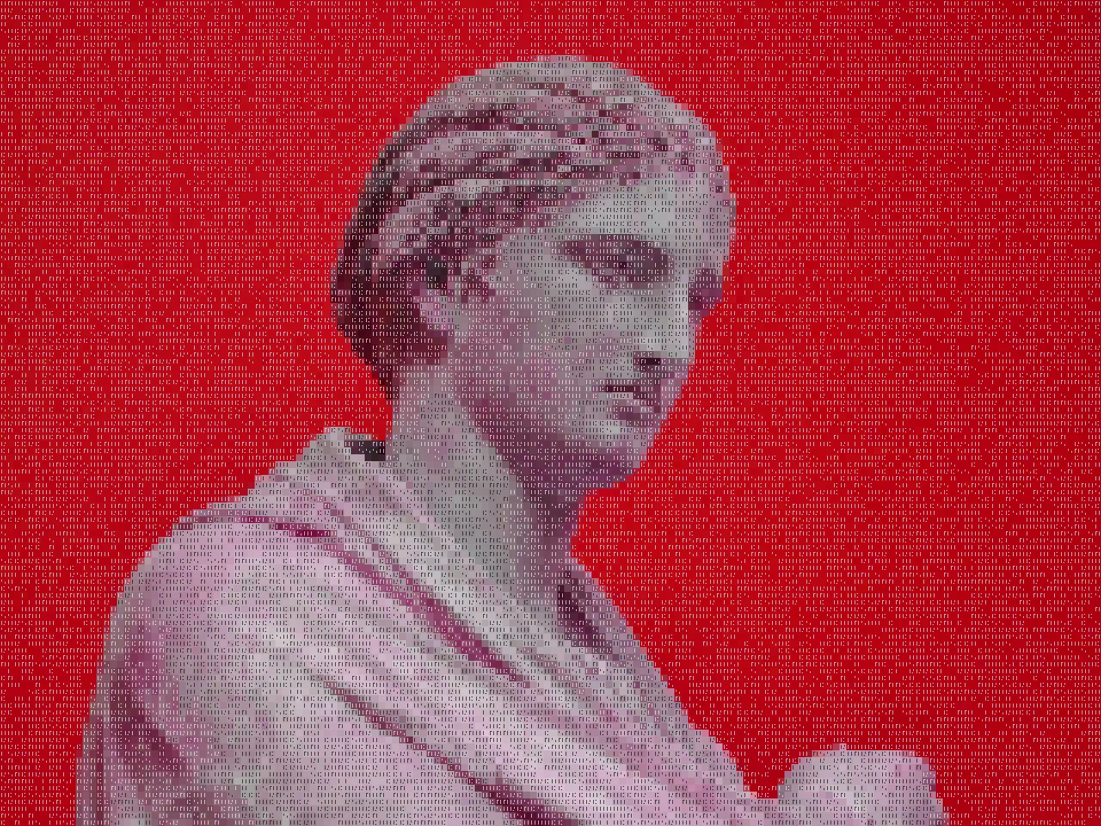
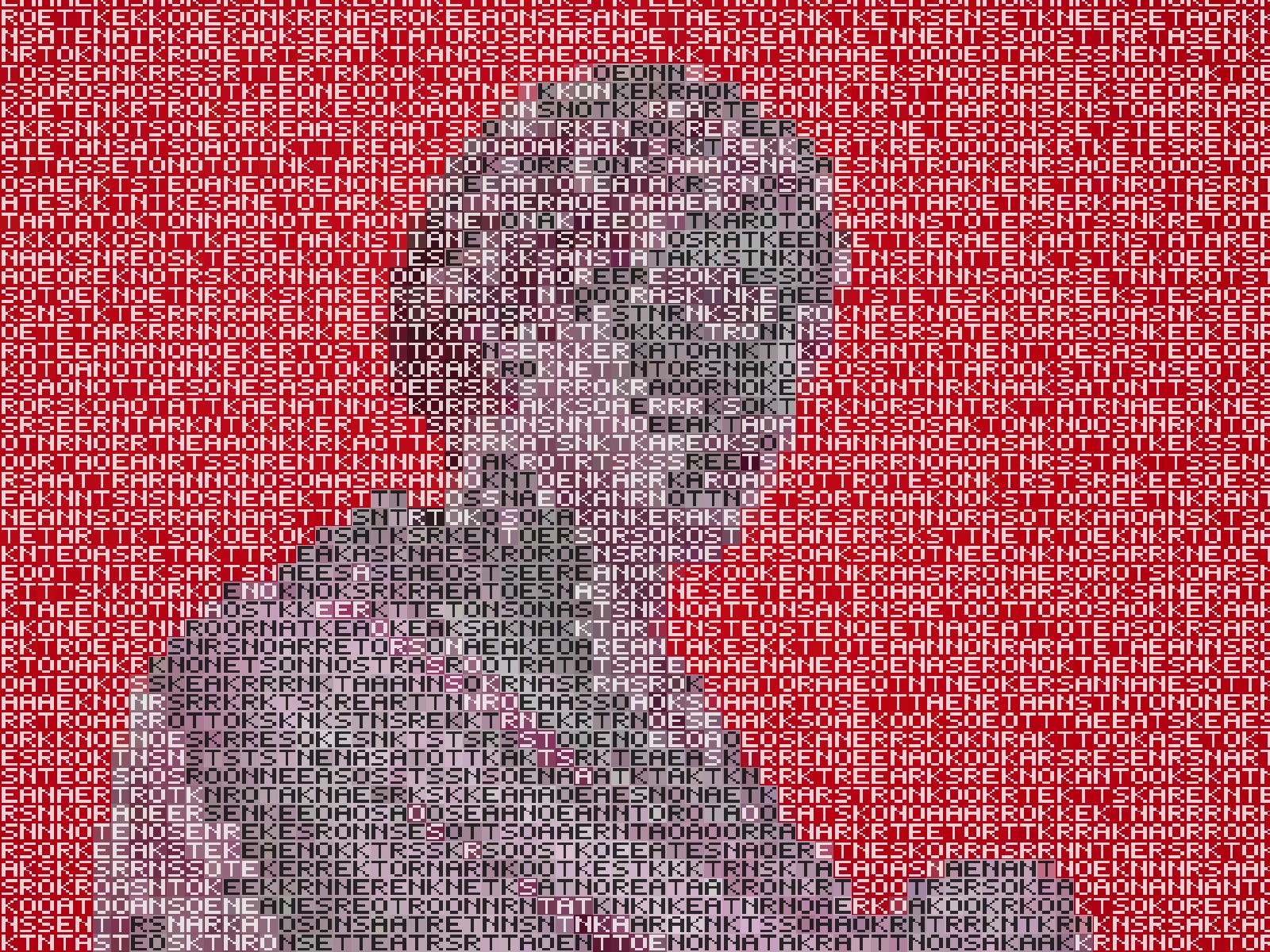
CELL sweep
03/ SPEC
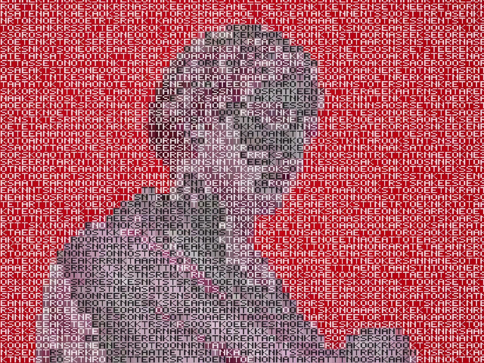
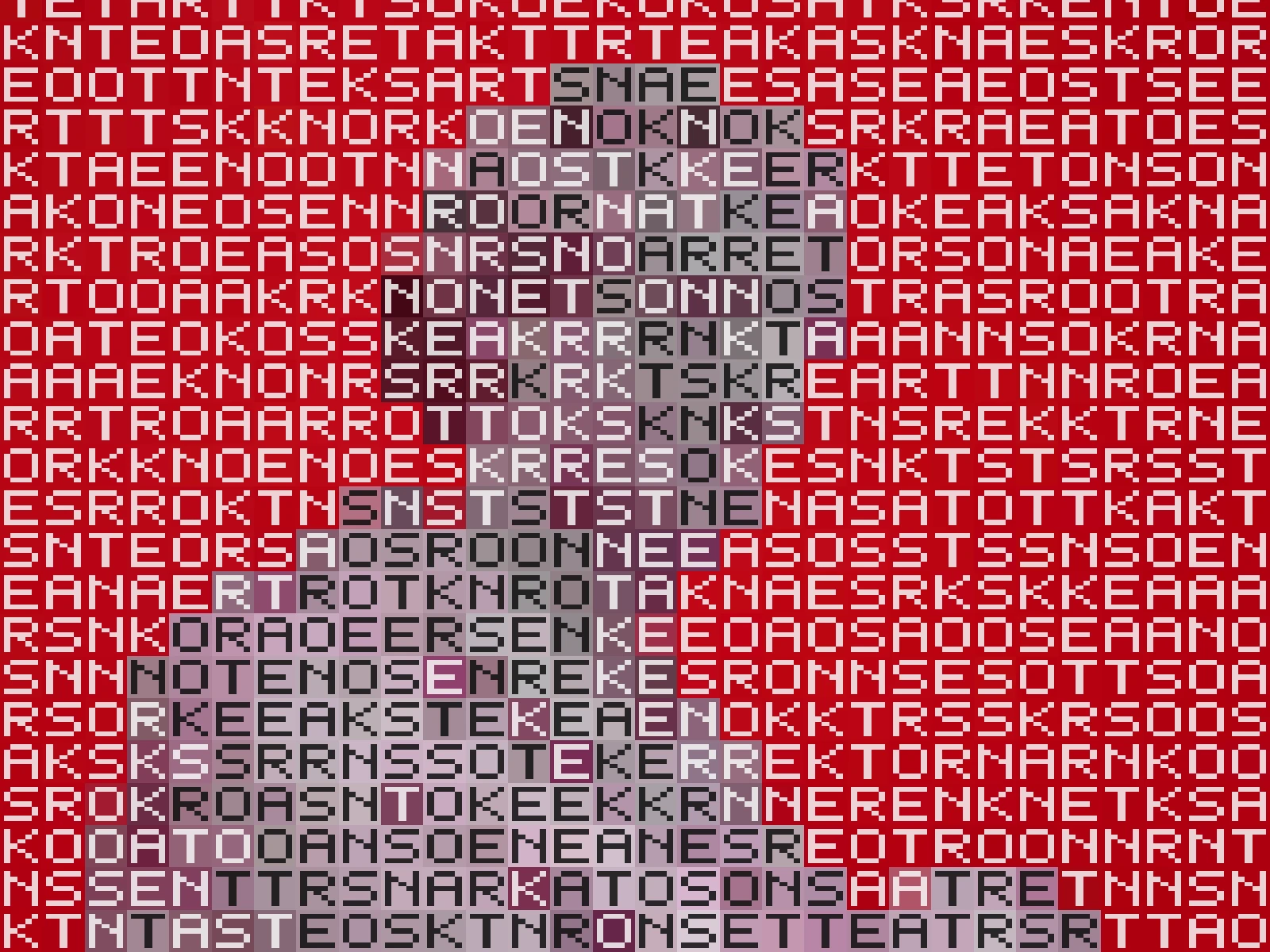
This effect samples the image on a grid and fills each cell with a set word rendered at the cell's average colour, so tone is carried by typography rather than by geometric tiles. CELL runs from 6 to 32 pixels with a default of 14 and sets the tile size, which determines how legible the words remain against how much image detail survives. GLYPH from 0 to 1 blends between the word shape and a plain colour fill, and SATURATION scales colour intensity. In kott it renders in natural colour so each word carries the hue beneath it.
04/ FAQ
- What is a word mosaic effect?
- A word mosaic effect rebuilds an image from set words rather than coloured tiles, rendering each word at the average colour of the area it covers so tone is carried by typography.
- How do I keep the words readable?
- Raise CELL toward 20 or above and keep GLYPH high. Small cells reduce the words to texture, which reads as pattern rather than as text.
- What is the difference between this and ASCII art?
- ASCII art picks single characters by how much ink they cover. A word mosaic places whole set words, so the unit of the image is a lexical choice rather than a density match.
05/ OUT