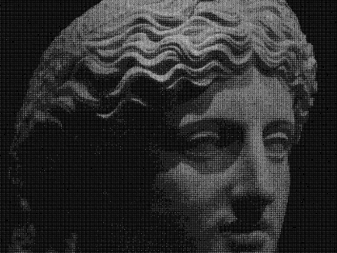
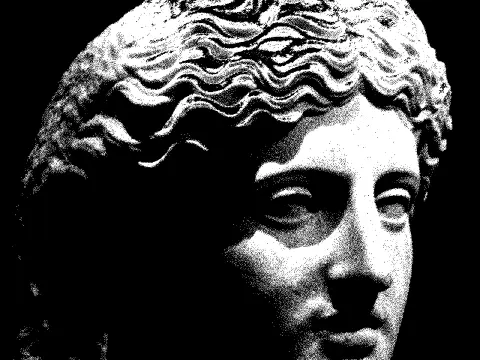
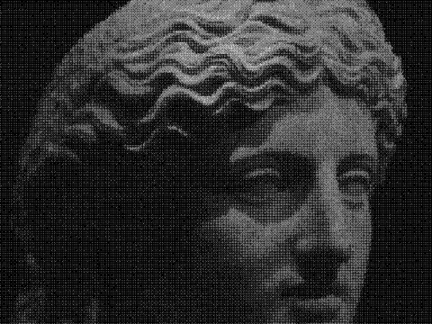
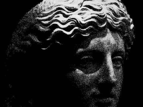
duotone effect
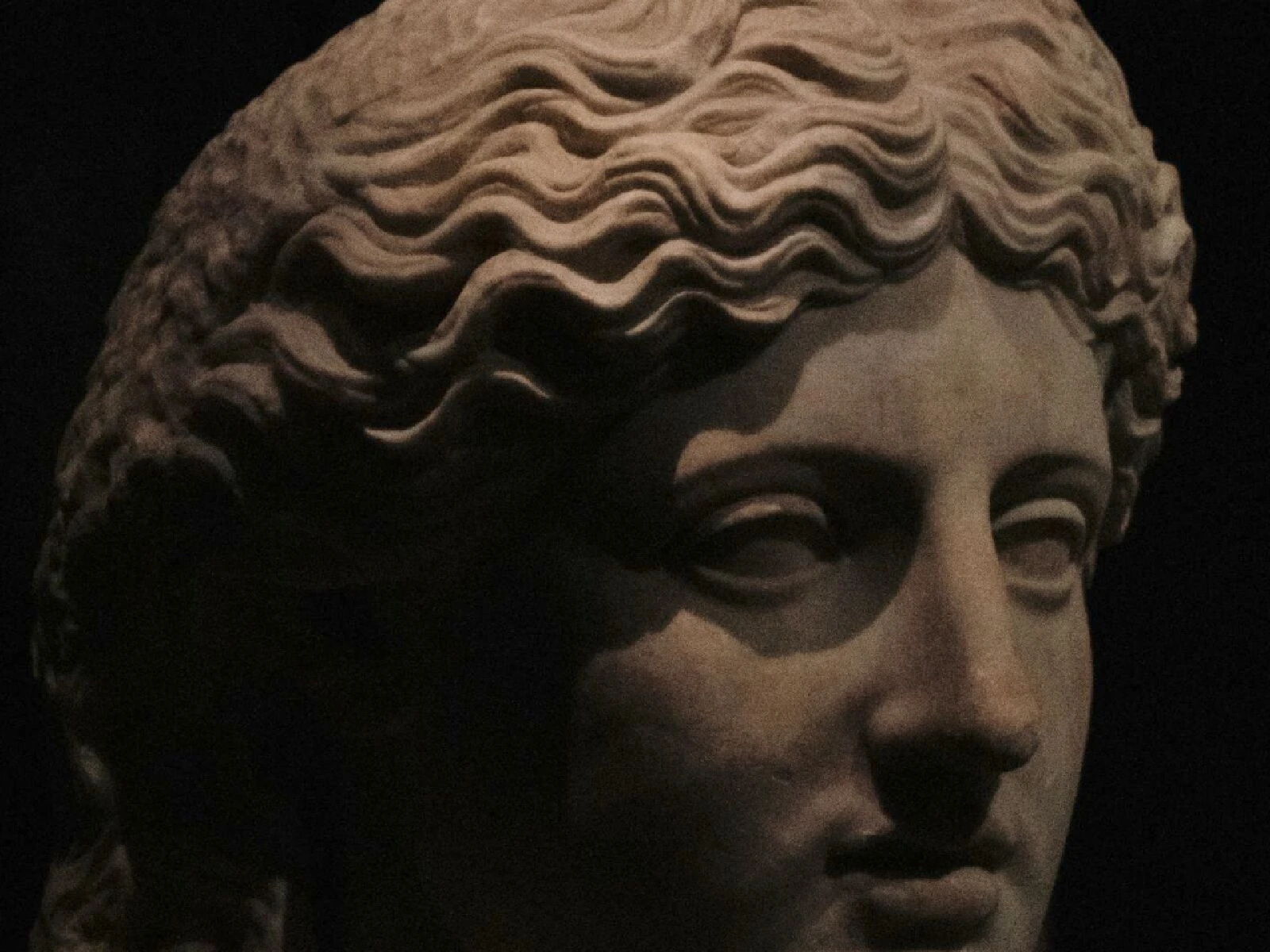
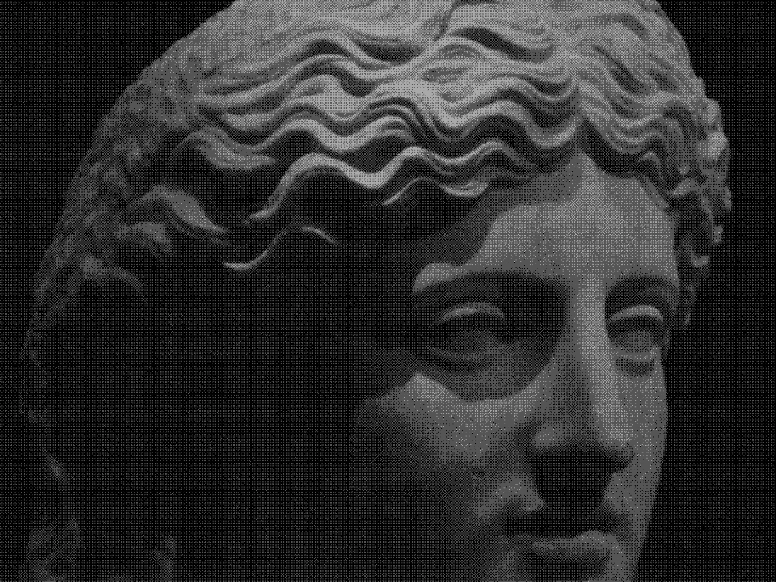 SourceEffect
01/ ORIGIN
Duotone came from the economics of printing. Four-colour work was expensive, and a photograph run in two inks, usually black and one spot colour, held far more tonal range than black alone at close to half the cost. Mid-century books, magazines and record sleeves are full of it. The look outlived the saving and returned as a deliberate choice in digital brand work through the 2010s, where a fixed two-colour treatment makes any photograph belong to the same system.
02/ SWEEP
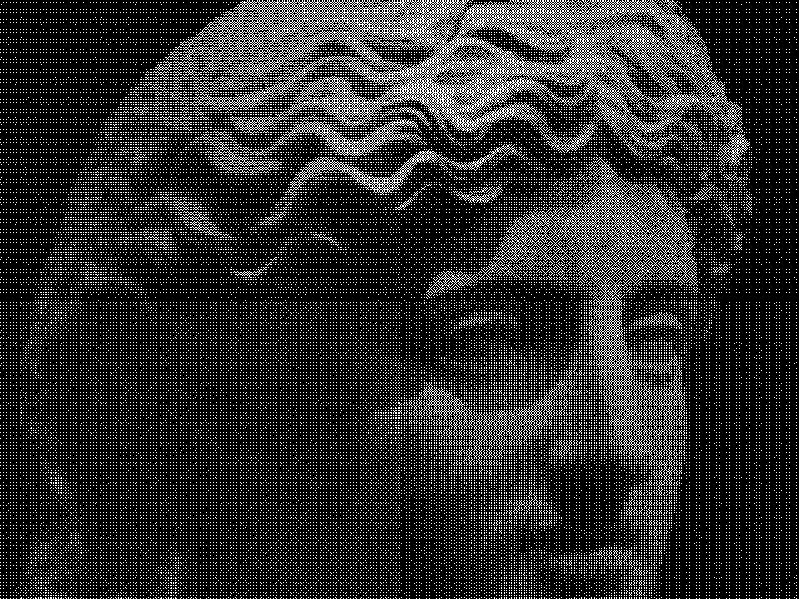
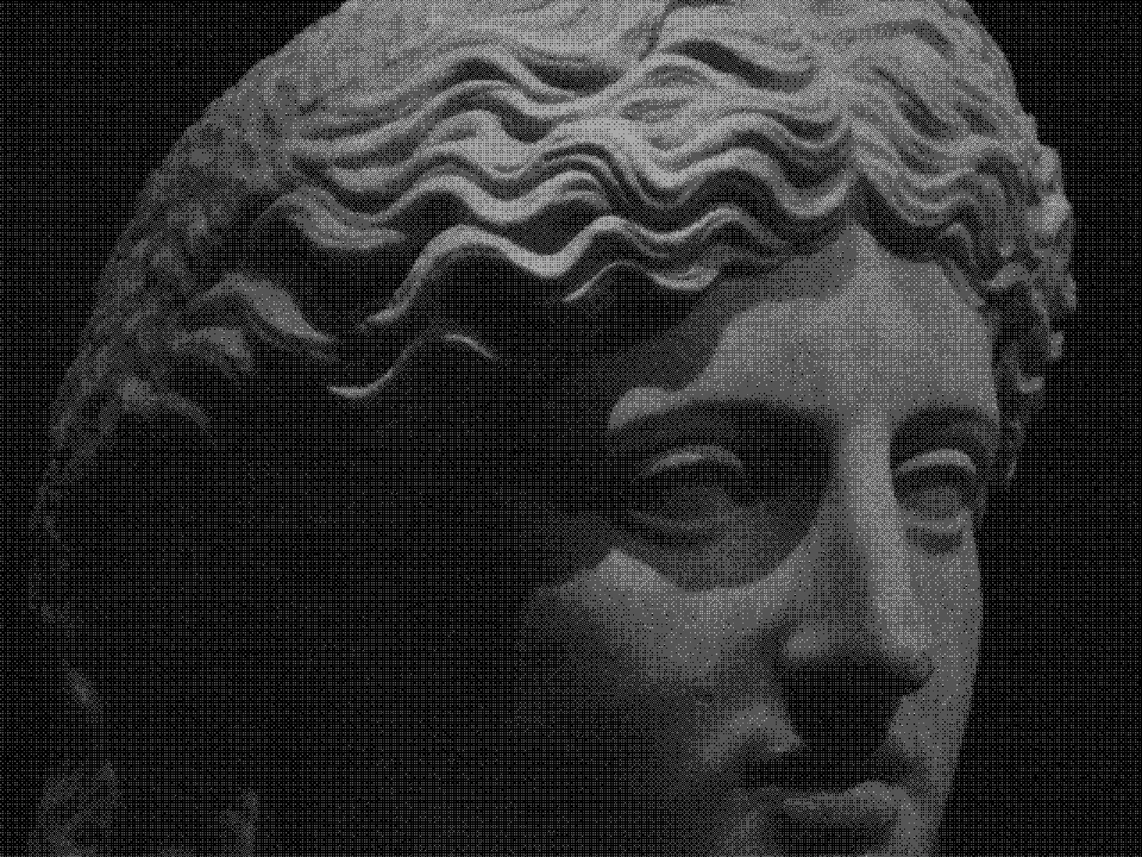
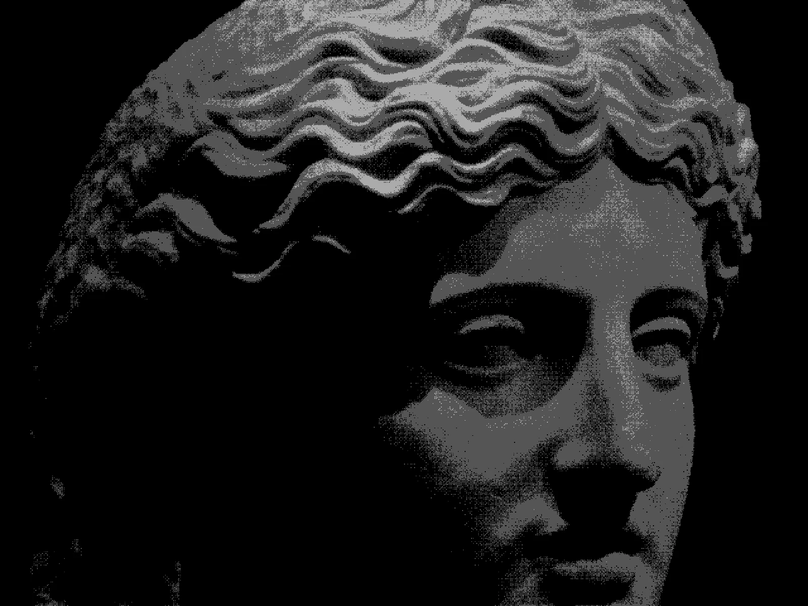
LEVELS sweep
03/ SPEC
This effect quantises the image to a small number of tonal steps and dithers between them, rendering the result in the two or more inks of the active colour mode. LEVELS runs from 2 to 8 with a default of 4 and sets how many steps the tonal range is divided into, which is the difference between a hard two-tone poster and something closer to a printed photograph. MATRIX chooses ORDERED, BLUE or tiled blue noise for the transition grain, THRESHOLD shifts the balance, and PIXEL scales the grain from 1 to 12 pixels. In kott the ink pair comes from the colour mode rather than from this effect.
04/ FAQ
- What is a duotone effect?
- A duotone effect renders a photograph in two inks rather than full colour, reducing tone to a limited number of steps. It came from printing, where two plates cost far less than four.
- What LEVELS value should I use for duotone?
- Two gives a stark poster-like split, and the default of 4 keeps recognisable form while staying graphic. Six or eight approaches a printed photograph and loses the two-colour character.
- What is the difference between duotone and a colour overlay?
- A colour overlay tints every pixel uniformly and keeps continuous tone. A duotone quantises tone into steps and dithers between them, so it reads as printed rather than as filtered.