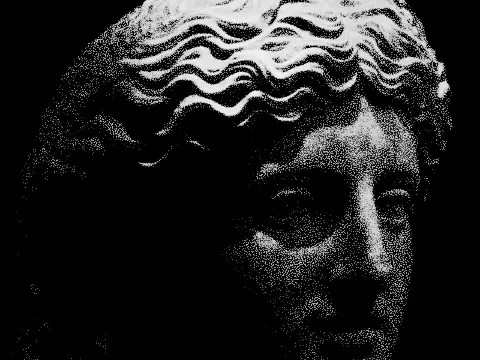
risograph effect
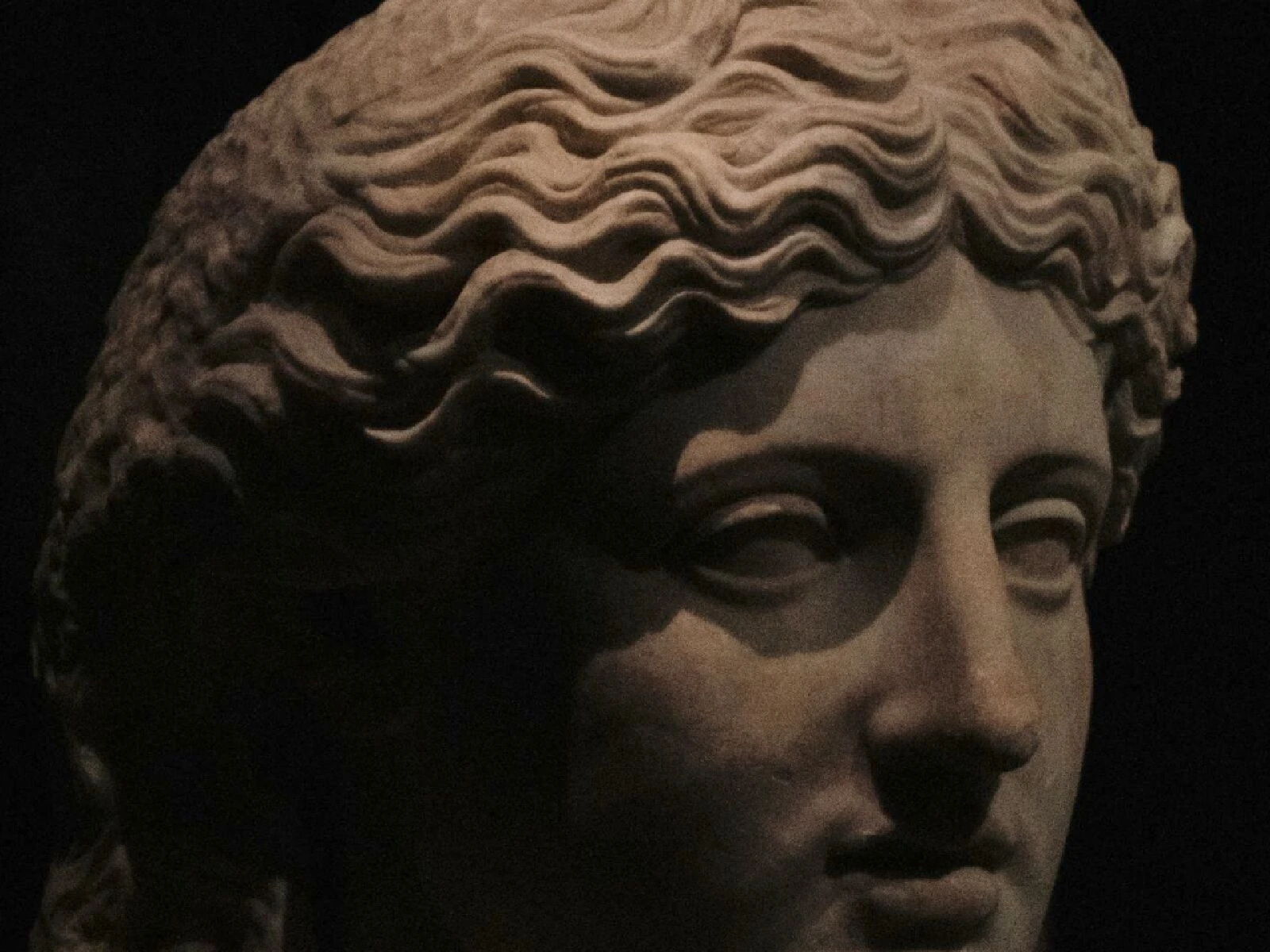
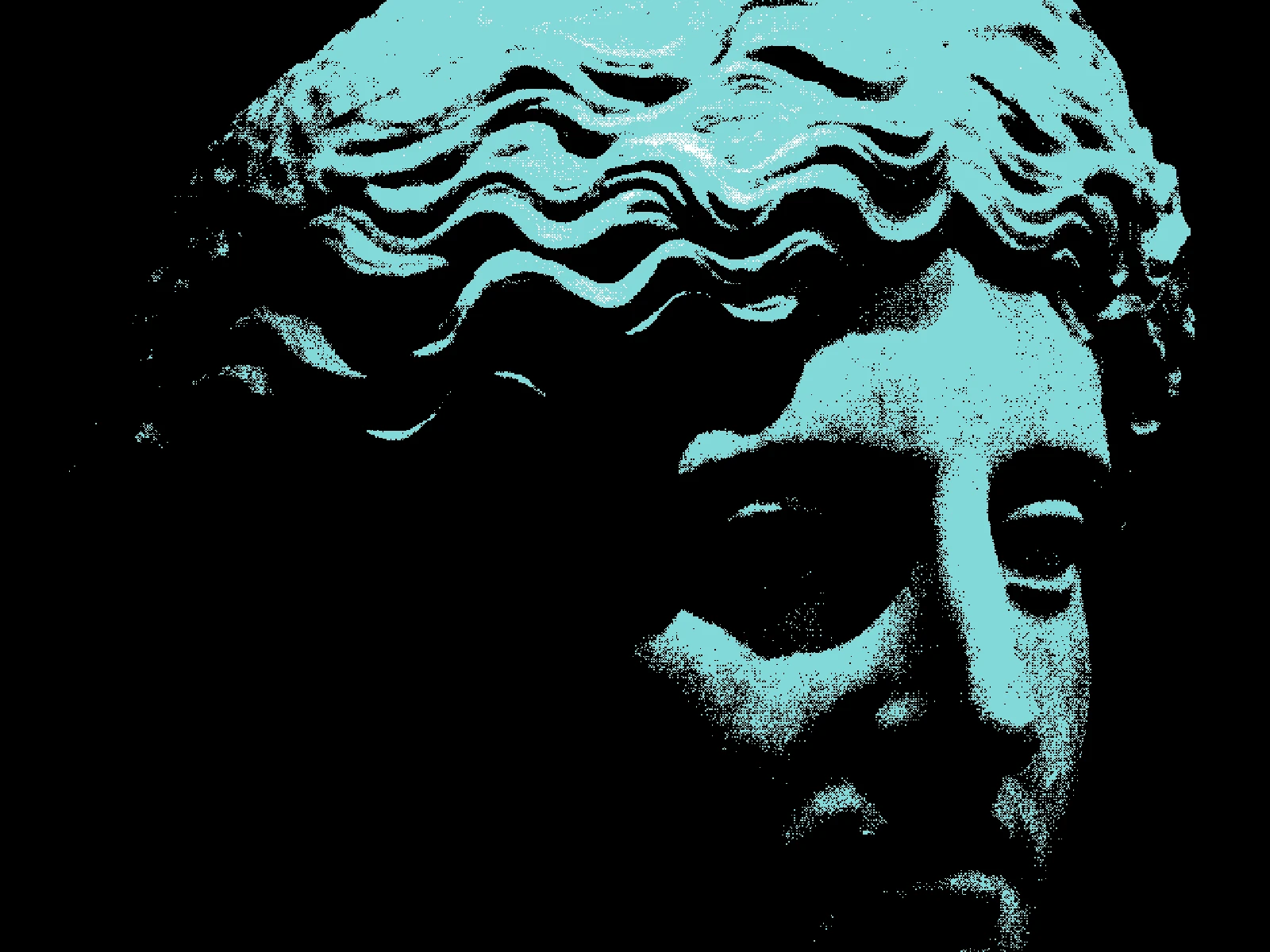 SourceEffect
01/ ORIGIN
Riso Kagaku began building duplicators in postwar Japan and brought the Risograph to market in the 1980s, using soy-based ink pushed through a stencil drum, one spot colour per pass. It was office equipment: cheap per copy, indifferent to fidelity. Small presses and zine printers adopted it decades later precisely for what an office would have called defects, since ink sits unevenly, passes never register perfectly, and two colours overlapping give a third nobody mixed.
02/ SWEEP
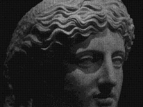
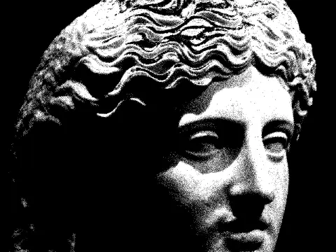
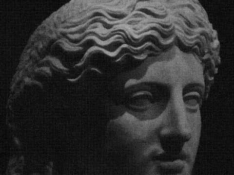
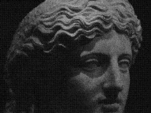
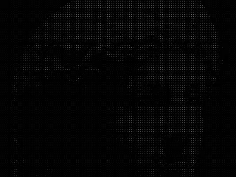
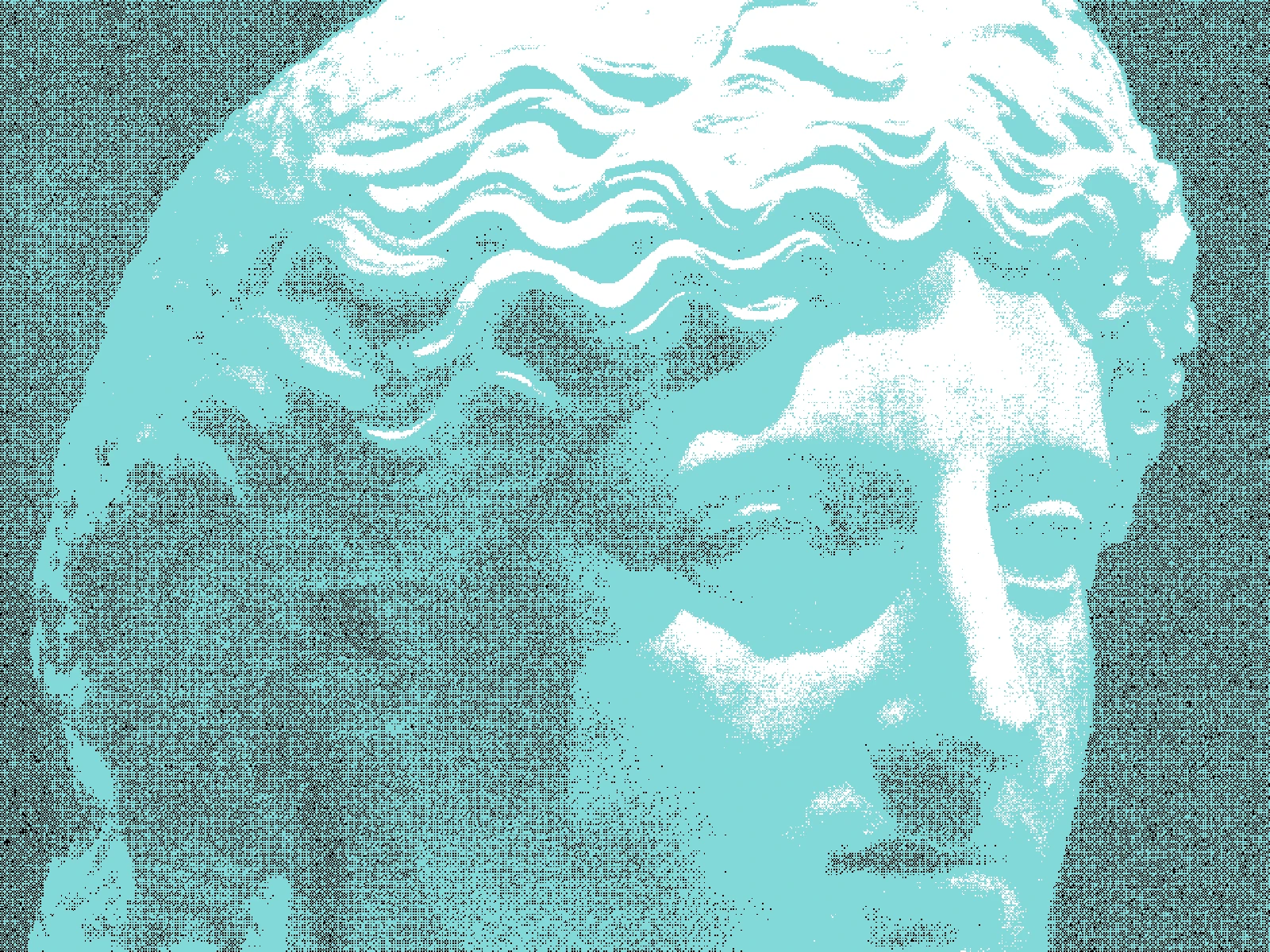
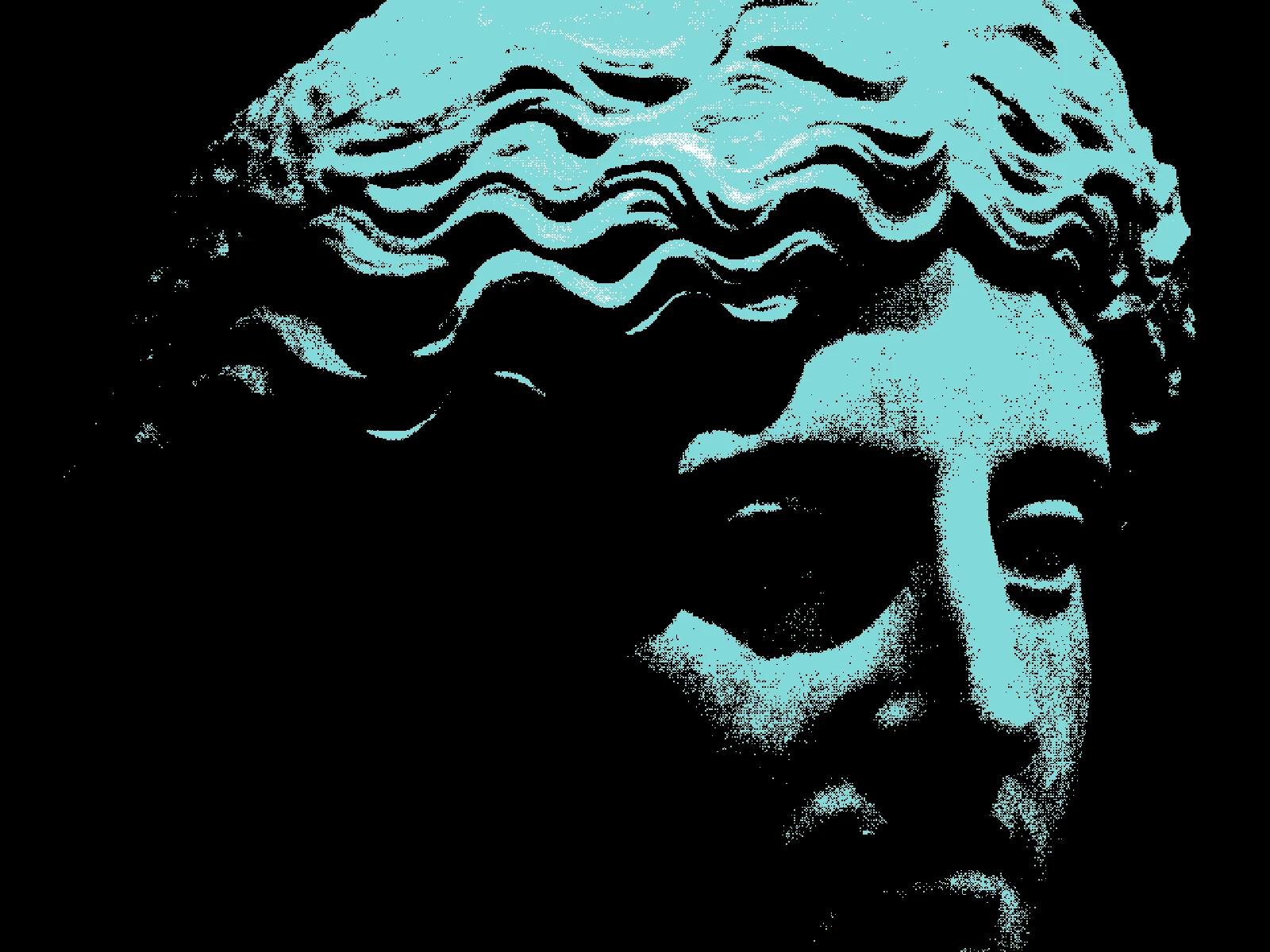
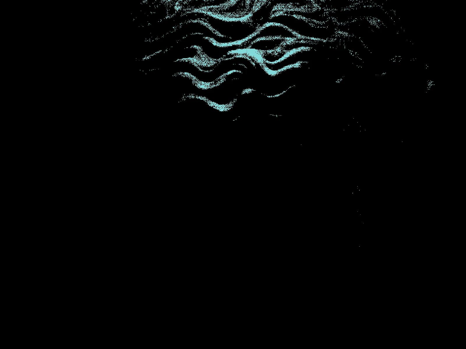
THRESHOLD sweep
03/ SPEC
This effect reduces the image to three flat tones and dithers the transitions between them, imitating a limited spot-ink print rather than a photographic gradient. THRESHOLD runs from 0.2 to 0.8 with a default of 0.5 and shifts where the boundaries between the three inks fall, which is the control that decides how much of the frame each colour claims. MATRIX chooses an ORDERED pattern or BLUE noise for the dithered transition. PIXEL scales that grain from 1 to 12 pixels. In kott the tones are drawn from the active colour mode, so a duotone pair or a full palette both work here.
04/ FAQ
- What is a risograph effect?
- A risograph effect imitates a Risograph duplicator print: a few flat spot inks laid down in separate passes, with dithered transitions and no smooth gradients. It reproduces the look of cheap stencil printing.
- Why does risograph printing look misregistered?
- A Risograph prints one colour per pass, so the paper is fed through more than once and never lands in exactly the same position. The small offset between passes is a defining part of the look.
- How do I choose colours for a riso effect?
- Pick two or three inks that stay legible where they overlap, since overlapping passes produce a fourth colour you did not choose. High-contrast pairs survive the tonal reduction best.